.svg)


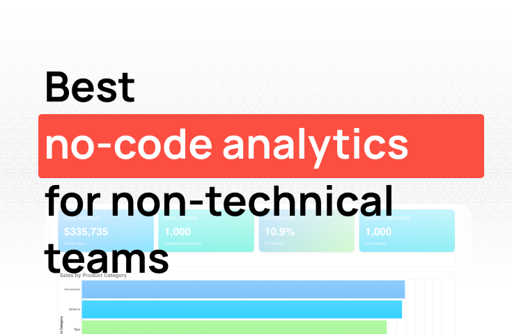
Best no-code data analytics platforms for non-technical teams

TL;DR: Most analytics dashboard guides assume you have a data team. This one doesn't. We cover what an analytics dashboard actually is, why the traditional path (warehouse, ETL, BI tool) doesn't work for most small teams, and a six-step process for going from scattered data to a live, shareable dashboard in a day. We also explain in plain English what a data warehouse and ETL pipeline are, when you actually need them, and when a tool like Fabi can handle that infrastructure for you. For teams that want the fastest path to a working dashboard, Fabi.ai connects directly to your databases and SaaS tools and lets you ask questions in plain English, no SQL or data engineering required.
Most analytics dashboard guides assume you have a data team. They tell you to "set up your data warehouse," "write a query to pull the right metrics," or "work with your BI tool administrator." Then they show a polished dashboard screenshot and call it a tutorial.
That's not how it works for most teams.
At a 30-person startup, the person who needs the dashboard is usually the same person who has to build it. There's no data engineer. There's no BI administrator. There's a product manager, a RevOps lead, or a head of growth who has data sitting in five different tools and a leadership team that wants a clear picture of what's happening.
This guide is for that person. Here's how to build an analytics dashboard when you're doing it yourself, without SQL, without a data warehouse, and without months of setup.
An analytics dashboard is a single view that pulls together the metrics your team needs to track, updated automatically from the data sources that feed them.
The key word is automatically. A spreadsheet that someone refreshes every Monday isn't a dashboard: it's a manual report. A real analytics dashboard connects directly to your data sources and updates on its own, so the numbers your stakeholders see on Thursday are the same numbers your data reflects on Thursday.
Good analytics dashboards do three things:
Everything else is secondary.
The traditional path to an analytics dashboard goes something like this: get your data into a warehouse, model it, connect a BI tool, build the dashboard, train your team on the tool. This process can take weeks, and that's before the inevitable round of "can you add this metric?" and "the numbers look different from what I expected."
It assumes a few things most small teams don't have:
A clean, central data source. Most small teams have data in multiple places (a CRM, a product analytics tool, a billing platform, a spreadsheet). Getting all of that into one warehouse is an engineering project.
Someone who can write SQL. Even "easy" BI tools require SQL for anything beyond the most basic charts. If nobody on your team writes queries, you're limited to pre-built reports that rarely answer the specific question you're asking.
Time to set it up and maintain it. Even if you get the dashboard built, keeping it accurate as your data structure changes requires ongoing attention.
The result is that most small teams end up with one of two things: a static spreadsheet someone maintains manually, or an expensive BI tool that took months to set up and that only one person knows how to use.
Neither of those is an analytics dashboard. They're workarounds.
When people talk about "setting up your data infrastructure," they're usually referring to two things: a data warehouse and an ETL process. These terms get thrown around as if everyone knows what they mean. Here's what they actually are.
A data warehouse is a central database that exists purely for analysis. Unlike your production database (which powers your app and needs to be fast and stable), a data warehouse is designed to handle complex analytical queries across large amounts of data. Think of it as a dedicated analytics layer: a single place where data from your CRM, billing system, product database, and other tools all lives together, structured in a way that makes it easy to query and combine.
ETL stands for Extract, Transform, Load. It's the process that moves data from your various sources into the warehouse. Extract: pull data from Salesforce, Stripe, your app database, etc. Transform: clean it, reshape it, join tables together, and make it consistent (your CRM might call it "company," your billing tool might call it "account": the ETL process reconciles these). Load: write the cleaned data into the warehouse. Tools like Fivetran, Airbyte, and dbt handle different parts of this process.
This infrastructure makes sense when:
If you're at this stage, hiring a data contractor to set up your warehouse and ETL pipelines is often the right move. A good contractor can get a basic warehouse running in two to four weeks and hand it off in a maintainable state. The resulting infrastructure is solid and flexible: any BI tool can connect to it, and your team isn't locked into a single vendor.
For most small teams, you don't need to set up your own warehouse and ETL pipeline to get started. What you need is a tool that connects to your existing data sources and handles the extraction, transformation, and loading for you behind the scenes.
That's what Fabi's application connectors do. When you connect HubSpot, Salesforce, Stripe, or another supported source, Fabi extracts your data and loads it into a managed data warehouse on your behalf. You don't configure the pipeline, you don't provision the warehouse, and you don't maintain either of them. The infrastructure is there; you just don't have to build it.
This means you get to analytics immediately. Connect your sources, ask questions in plain English, and get dashboards back in minutes, not weeks.
As your company grows and you want to move to your own data warehouse, that's a natural next step. Fabi connects directly to Postgres, MySQL, BigQuery, Snowflake, and others, so your team can migrate to a warehouse you own and control without switching analytics tools. The workflow stays the same; the infrastructure underneath scales with you.
The honest answer on when to start with managed connectors vs. your own warehouse: if you're early stage, don't have a data engineer, and want to get to insights quickly, let Fabi handle the infrastructure. When you have the resources and requirements to manage your own warehouse, the migration path is there.
Here's a process that works for teams without technical resources. The goal is a live, shareable dashboard that you can build in a day, not a month.
Before you touch any tool, write down the three to five questions your dashboard needs to answer. Not the metrics: the questions.
"What is our monthly recurring revenue?" is a question. "Revenue" is not.
Good questions are specific enough that you'd know exactly what the answer looks like. "Which acquisition channels are driving the most qualified pipeline?" is specific. "How is marketing doing?" is not.
This step sounds obvious but most people skip it. They open a tool, start connecting data sources, and end up with a dashboard full of metrics nobody looks at because they were never tied to a real question.
Write down your questions first. Three to five is usually enough. More than that and you're building a reporting portal, not a dashboard.
For each question, work out where the underlying data lives. Be specific:
The goal isn't to move all of this data somewhere central. It's to know what you're working with before you pick a tool, because the tool needs to connect to these sources, and not all tools connect to all sources.
This is where most guides go wrong: they recommend the most powerful tool rather than the right tool. Here's a more honest breakdown based on your situation.
If your data lives in a database or data warehouse (Postgres, MySQL, BigQuery, Snowflake):
Use a tool with a direct database connection and a natural language interface. You want to be able to ask "show me monthly active users by plan type" and get a chart back, without writing the SQL yourself. Fabi is built for this: connect your database, ask questions in plain English, and get charts and dashboards that update automatically. Setup takes minutes, not weeks.
If your data lives in SaaS tools (HubSpot, Salesforce, Stripe, etc.):
You have two options. Some tools connect directly to SaaS APIs. Fabi supports HubSpot, Salesforce, Stripe, and more, so you can pull data from those tools without any export/import workflow. Alternatively, tools like Looker Studio connect to Google's ecosystem for free, which works well if most of your data is in Google Analytics, Google Ads, or Google Sheets.
If your data is mostly in spreadsheets:
Start with what you have. Tools like Fabi work with CSV and Google Sheets alongside live database connections, so you don't need to migrate to a database before building your first dashboard. This is often the fastest path from zero to a useful dashboard: connect the sheet, ask your questions, and upgrade to a live data connection later when you need it.
If you're mixing data from multiple sources:
This is the hardest case, and it's where most small teams get stuck. The honest answer is that combining data from, say, HubSpot and Stripe in a single dashboard usually requires either (a) a tool that can connect to both directly, or (b) exporting both to a shared database. If you don't have a database, look for a tool with native multi-source connections before assuming you need to build infrastructure first.
Once you've picked a tool, start with one question, not five. Build a single chart that answers your most important question, verify that the numbers are right, and get one other person to sanity-check it.
This sounds conservative, but it matters. A dashboard full of wrong numbers is worse than no dashboard. Building one chart at a time lets you validate the underlying data before you build on top of it.
With an AI-native tool like Fabi, this step looks like: connect your data source, type your question in plain English ("show me MRR by month for the last 12 months"), and the AI generates the SQL and chart. You can see the query behind it if you want to verify the logic, but you don't have to. Once the chart looks right, save it to a Smartbook and move to the next question.
A chart showing revenue trending down is less useful than a chart showing revenue trending down alongside the change in new customer acquisition that preceded it. Raw metrics tell you what happened. Context tells you why.
Once you have your core charts built, add one layer of context to each:
This is where most self-built dashboards stop short. The numbers are there, but the story isn't. Context is what turns a dashboard from a report into a decision-making tool.
A dashboard nobody looks at isn't useful. The last step is making sure your dashboard reaches the people who need it, without requiring them to log into another tool.
Set up a scheduled report that sends the key metrics to Slack or email on a regular cadence, weekly for most operational metrics, daily if you're tracking something time-sensitive. This keeps stakeholders informed without requiring them to remember to check the dashboard, and it creates a lightweight accountability loop around the metrics you've agreed matter.
One more thing: schedule a quarterly review of the dashboard itself. Business priorities change, and a dashboard built around last year's questions becomes noise. Every three months, ask whether each metric is still informing a decision. Remove the ones that aren't. Add new ones if priorities have shifted. The goal isn't to preserve the dashboard: it's to keep it useful. Most dashboard graveyards are filled with dashboards that were never updated after they were built.
Here's what a reasonable analytics dashboard looks like for three common roles:
Product manager: Monthly active users by plan, feature adoption rates for the last release, support ticket volume broken down by type, activation rate for new signups. All pulling from a product database and support tool.
RevOps lead: Pipeline by stage and source, average deal cycle by segment, MRR with new/expansion/churn breakdown, open renewal value by account tier. Pulling from CRM and billing data.
Growth marketer: Paid spend and CAC by channel, organic traffic and conversion rate by page, trial-to-paid conversion rate, MQL to opportunity rate. Pulling from ad platforms, Google Analytics, and CRM.
None of these require a data team to build. They require clear questions, data in a connected tool, and about a day of setup.
If the six steps above still sound like more work than you have time for, there's a faster path.
AI-native analytics tools have changed what's possible for non-technical teams. Instead of building dashboards through a series of configuration steps, you describe what you want in plain English and the AI builds it. "Show me weekly active users segmented by plan for the last 90 days" returns a chart in seconds. Follow-up questions work the same way: the AI tracks context across the conversation, so you can refine, segment, and drill down without starting over.
We built Fabi specifically for teams in this situation: you have data, you don't have a data team, and you need answers now. Connect your data sources (databases, SaaS tools, or spreadsheets), ask questions in plain English, and get dashboards your whole team can use. The first setup takes less than an hour. The first chart takes less than a minute.
Do I need SQL to build an analytics dashboard?
Not anymore, for most use cases. Traditional BI tools require SQL for anything beyond basic charts, which is a real barrier for non-technical teams. AI-native tools like Fabi let you ask questions in plain English and generate the underlying SQL automatically: you can inspect it if you want, but you never have to write it yourself. If your dashboard needs are straightforward (standard metrics from one or two sources), you may never need to touch SQL at all. If you're doing complex multi-source analysis or custom data modeling, having someone who can review generated queries is useful, but it doesn't need to be you.
How long does it actually take to build an analytics dashboard?
It depends heavily on where your data lives and how clean it is. With direct application connectors and an AI-native tool, a single-source dashboard (say, a RevOps dashboard pulling from HubSpot) can go from zero to shareable in a few hours. A multi-source dashboard combining CRM, billing, and product data typically takes a day or two, mostly spent validating that the numbers are right rather than building. The traditional path (warehouse setup, ETL pipelines, BI tool configuration) can take weeks or months. The difference isn't the dashboard itself; it's the data infrastructure underneath it.
What's the difference between an analytics dashboard and a report?
A report is a snapshot: it shows you what happened over a specific period, usually generated manually and sent as a file or slide deck. An analytics dashboard is live: it connects directly to your data sources and updates automatically, so the numbers are always current. Reports are useful for structured reviews (quarterly board updates, monthly all-hands). Dashboards are useful for ongoing monitoring, the kind of thing you glance at weekly or that stakeholders can check themselves without asking someone to run it.
When should I hire a data person instead of using a tool?
Hiring makes sense when your data needs have outgrown what a tool can handle on its own. Specific signals: you're regularly combining five or more data sources in complex ways, your analysis requires custom data modeling that tools can't automate, you have compliance or governance requirements that need a controlled data layer, or the time your non-data team members are spending on data work has become a material distraction from their actual jobs. A good data hire or contractor will set up the infrastructure (warehouse, ETL pipelines, documented data models) that makes everything downstream faster and more reliable. Tools and people aren't mutually exclusive: most mature small data teams use both.
What if my data isn't clean?
This is the most common obstacle, and it's worth being honest about: no tool fixes genuinely bad data. If your CRM has duplicate records, your product database has inconsistent event naming, or your Stripe data has been miscategorized, those problems will show up in your dashboard regardless of what tool you use. Before investing in a dashboard, do a basic audit of your most important data source. Look for obvious issues (duplicates, missing values, inconsistent naming conventions) and fix them at the source. Once the underlying data is reliable, building on top of it is straightforward. Trying to build a dashboard on unreliable data means you'll spend more time explaining anomalies than using the insights.
A few common mistakes that waste time or produce dashboards nobody trusts:
Building before agreeing on definitions. "Active user" means different things to different people. Before you build the chart, agree on the definition. Otherwise you'll spend more time defending the numbers than using them.
Too many metrics. A dashboard with 20 metrics is a report. Stick to the five or six numbers that would change a decision if they moved.
Skipping the sanity check. Always validate your first dashboard against a number you already know. If your MRR chart shows a different number than what's in your billing tool's summary, find out why before sharing it with anyone.
Building in a tool that only one person can update. If the dashboard breaks or needs a new metric and only one person knows how to fix it, you've created a dependency. Use a tool your team can maintain without a specialist.