.svg)


Top 5 AI-native business intelligence tools for 2026

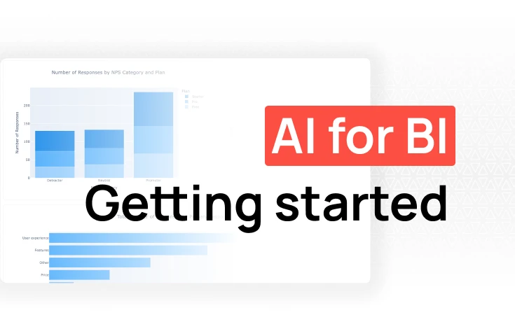
TL;DR: Most "no-code" analytics tools still require a data team to configure them, model your data, or maintain the dashboards. AI-native platforms like Fabi.ai represent a genuine step forward: describe what you want in plain English, get a working analysis. For product, marketing, and RevOps teams that need real self-service, the newer generation of tools is worth a close look. Traditional options like Power BI, Tableau, and Domo are covered here too, but manage your expectations on what "no-code" actually means for each.
There's a persistent gap between what most companies own and what most people on those teams can actually use.
The data exists. It's sitting in your warehouse, your CRM, your product database. But getting to it still requires SQL, a ticket to the data team, or a pre-built dashboard that doesn't answer quite the question you have. For product managers, marketers, finance leads, and RevOps teams, this gap is a daily frustration. If SQL is the specific bottleneck, we wrote a separate guide on how to build dashboards without writing SQL.
No-code data analytics platforms were supposed to fix this. And some have made real progress, but "no-code" covers a wide range of products, from genuinely accessible AI-native tools to traditional BI platforms that swapped out a query editor for a drag-and-drop interface that still requires a data engineer to set up the underlying data model.
This guide breaks down what each category actually delivers, so you can find the right fit for your team.
The term gets applied to two very different things:
Visual builders: Tools like Tableau, Power BI, and Domo replace SQL with drag-and-drop interfaces. You can build charts without writing code, but someone still needs to connect your data sources, define your metrics, and build the semantic layer that makes the tool useful. That's typically a data or BI engineer. For business users, the experience is "self-service within a pre-built environment," not true independence.
AI-native tools: Newer platforms let you describe what you want in plain English. The tool writes the SQL, runs it, and returns a result. No drag-and-drop required, no pre-built dashboard to find the right metric inside. This is a meaningfully different experience for non-technical users, closer to asking a question than using software.
Neither category is wrong. They solve different problems. But understanding which type you're looking at helps set realistic expectations.
The no-code label tells you something about the interface. It doesn't tell you much about whether the tool will actually work for your team day-to-day. Three things matter beyond whether you have to write SQL.
Most AI analytics tools give you a chat box and access to your data. That's a start, but it creates two problems in practice.
First, the AI doesn't know your business. It can read column names, but it doesn't know that "active users" in your product means something specific to your company, or that the orders table should always be filtered to exclude test accounts, or that one data source is unreliable and should never be used for executive reporting. Without that context, you get technically correct answers that are wrong for your business.
Second, unrestricted AI access to your data is a governance problem. A product manager shouldn't be able to accidentally query compensation data. A contractor shouldn't see customer PII. The best platforms let data teams scope what each user or role can access, and constrain the AI to operate within those boundaries — so self-service doesn't come at the cost of control.
Look for: scoped AI access by role, the ability to define business context and metric definitions the AI respects, and clear audit trails for what was queried.
Non-technical teams don't check analytics dashboards proactively. They work in Slack, email, and Google Sheets. A dashboard that requires people to remember to look at it is a dashboard that mostly doesn't get looked at.
The platforms that actually drive behavior change push insights to where decisions happen: a weekly revenue summary in the right Slack channel, an alert when a key metric drops below a threshold, a Google Sheet that refreshes automatically before Monday's standup. This turns analytics from something you have to go get into something that comes to you.
Slack integration in particular is worth evaluating closely. Scheduling a report to post on a cadence is table stakes. More useful is the ability to answer ad hoc questions directly in Slack, or to trigger alerts when something unexpected happens in your data.
There's a meaningful difference between an AI that does exactly what you ask and one that helps you ask better questions.
Non-technical users often don't know what they don't know. They ask for "revenue last month" when they actually need "recognized revenue excluding refunds, filtered to paying customers." A compliant AI returns the first answer. A collaborative one asks which revenue definition you mean before running the query.
The same applies when results look unusual. A good AI analytics tool should flag when a number seems off, suggest a related analysis that might be more useful, or point out when your framing could lead to a misleading conclusion. It should be willing to say "that question is ambiguous" rather than just picking an interpretation and running with it.
This matters more for non-technical users than for data analysts. An analyst can spot a suspicious result and dig in. A product manager or marketer is more likely to take the output at face value and present it in the next meeting. An AI that acts as a collaborative partner — asking clarifying questions, surfacing caveats, pushing back when something doesn't add up — is genuinely more useful than one that just executes.
Fabi is built for the teams that feel the data bottleneck most acutely: product managers, growth marketers, and RevOps. Instead of clicking through dashboards or submitting requests to the data team, you ask questions in plain English and get working SQL, Python, and visualizations back.
What makes us different from traditional no-code tools: Fabi's Analyst Agent understands your data structure, remembers context across a session, and can help you go from raw question to shareable dashboard without writing a single line of code. We connect to hundreds of data sources: warehouses like Snowflake, BigQuery, and Postgres, plus SaaS tools like HubSpot, Salesforce, and Stripe, so your data is accessible without pipeline work. For a deeper look at how self-service analytics actually works in practice, see our guide to self-service analytics with AI.
Finished analyses can be published as live dashboards that auto-refresh and share cleanly with stakeholders who never need to touch the underlying notebook.
Best for: Product managers, RevOps, growth marketers, and data analysts at SMBs who need fast answers from multiple data sources without depending on engineering.
Pros:
Cons:
Google's free dashboard builder (formerly Data Studio) connects cleanly to Google Analytics, Google Ads, BigQuery, and Google Sheets. If your team already lives in the Google ecosystem and just needs to visualize what's there, it's hard to argue with free.
Best for: Marketing teams with Google-centric data stacks who need quick, shareable dashboards.
Pros:
Cons:
Metabase is popular with technical teams who want an accessible interface on top of their database without a heavy BI platform. The visual query builder lets non-technical users explore data, but a data engineer typically needs to set it up, connect the sources, and keep it running.
Best for: Engineering-led companies that want to give business users read access to their database through a managed interface.
Pros:
Cons:
Power BI is one of the most widely used BI tools globally, largely because it's bundled with Microsoft 365. For organizations already in the Microsoft stack, the integration story is strong: Excel, SharePoint, Teams, Azure: it all connects.
The "no-code" label is generous. Power BI has a drag-and-drop report builder, but building a useful dashboard still requires configuring data sources, writing DAX formulas, and building a proper data model. Most implementations involve a dedicated BI developer or data team.
Best for: Microsoft shops that want centralized reporting and have a BI team to build and maintain it.
Pros:
Cons:
Tableau produces some of the most sophisticated data visualizations available in any tool. Its drag-and-drop interface can build charts that would take significant code elsewhere. But calling it "no-code" for non-technical users is a stretch: getting real value from Tableau still requires understanding data structures, building calculated fields, and connecting data sources correctly.
Best for: Organizations with a dedicated analytics team that wants to produce high-quality visualizations for executive or external audiences.
Pros:
Cons:
Domo positions itself explicitly around business users, with mobile-first dashboards, pre-built connectors, and a focus on executive visibility. It's more accessible than Tableau or Power BI from the business user side, but you still need a BI team or Domo specialist to configure it properly.
Best for: Larger organizations that want executive dashboards and already have a BI team to manage the platform.
Pros:
Cons:
Polymer targets marketing teams specifically, offering a simple interface for building charts from CSV uploads, Google Sheets, or ad platform exports. It's genuinely low-friction for its target use case but is limited in depth.
Best for: Marketing teams that want quick charts from spreadsheet exports without BI complexity.
Pros:
Cons:
If you're specifically evaluating tools for a non-technical team, we also compared the best AI analytics tools for non-technical users with a focus on ease of setup and accessibility.
What is the best no-code data analytics platform for non-technical users?For genuinely non-technical users (product managers, marketers, RevOps), AI-native tools like Fabi offer the lowest friction. You can ask questions in plain English and get answers without understanding SQL or data modeling. Traditional "no-code" tools like Power BI and Tableau still require meaningful technical knowledge to set up and use effectively.
Can non-technical users really do data analysis without SQL?Yes, with the right tool. AI-native platforms generate SQL from natural language, so you describe what you want and the tool handles the query. Visual builders (Power BI, Tableau) reduce but don't eliminate the need for technical understanding. The key question is whether your data sources are already connected and your data model is already defined: that upfront work usually still requires a data team.
What's the difference between no-code analytics and AI analytics?No-code analytics typically means visual interfaces (drag-and-drop charts, click-to-filter dashboards) that replace query writing. AI analytics goes further: you describe what you want in natural language, and the tool generates the query, runs it, and returns a result. AI analytics is a superset of no-code, and meaningfully more accessible for non-technical users.
Which is better for non-technical users: Tableau or Power BI?Neither is genuinely accessible for non-technical users who want to build their own analyses. Both require significant setup by a data or BI team before business users can explore independently. If you're choosing between them for a non-technical audience, the real question is which one your BI team prefers: for the business users consuming dashboards, the experience is similar. If true self-service is the goal, an AI-native tool is a better starting point.
Is no-code analytics secure enough for business data?Reputable platforms handle encryption, access controls, and role-based permissions. The security question is less about no-code vs. code and more about the specific vendor: look for SOC 2 compliance, SSO support, row-level security, and data residency options if those matter for your industry. Most enterprise-grade platforms on this list meet standard security requirements.