.svg)


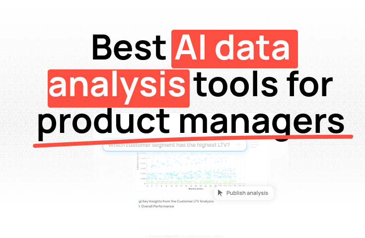
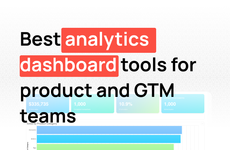
Best AI data analysis tools for product managers

TL;DR: Amplitude and Mixpanel are purpose-built product analytics platforms, but they're not the only way to track how users interact with your product. If your product data lives in a database, you can build a product analytics dashboard without any dedicated event tracking tool. This guide covers what a product analytics dashboard needs to show, what Amplitude and Mixpanel do that you can replicate, and how to build the whole thing from your existing data. For teams that want to skip the event instrumentation entirely, Fabi connects directly to your product database and lets you ask questions in plain English, without SQL.
Amplitude and Mixpanel are the default recommendation for product analytics. They're good tools. But the path to actually using them is longer than most PMs expect.
You need budget approval Amplitude's growth tier starts around $995/month). You need engineering time to instrument events, typically two to four months for reasonable coverage. Then you need time for the data to accumulate before you can trust it. By the time you have a working dashboard, the product may have already shipped three iterations.
That delay is the real reason teams look for alternatives. Not philosophy — time.
If you're at an early-stage startup, you may not have the engineering bandwidth to set up proper event tracking. If you're a PM at a B2B SaaS company, your product data might already live in a Postgres database. If you're trying to build product dashboards quickly, you probably don't want to wait two months before you can see anything.
This guide is for those situations. Here's how to build a product analytics dashboard from your existing data, without Amplitude, without Mixpanel, and without rebuilding your entire data stack.
Before you pick a tool, it helps to understand what product analytics actually requires. Most product teams need to track a small set of core metrics:
User activity metrics:
Activation and adoption:
Retention:
Product funnel:
Amplitude and Mixpanel are designed to answer these questions using frontend event tracking: your engineering team instruments the product to fire events on each user action, and the tools aggregate and visualize those events. It's flexible and powerful, but it requires that infrastructure to exist first.
If your product data is already in a database, many of these same questions can be answered by querying it directly. Not all of them, and not always with the same granularity, but enough to build a dashboard your team can actually use.
The table isn't meant to make Amplitude or Mixpanel look bad. They're powerful tools for the problems they're built to solve. The question is whether you actually need those specific capabilities before you've exhausted what your existing database can tell you.
PostHog belongs in this conversation separately from Amplitude and Mixpanel. It's open-source, self-hostable, covers session replays, feature flags, and event analytics in one platform, and is significantly cheaper at scale. If you need client-side event tracking, PostHog is the default recommendation for startups on a budget — not Amplitude or Mixpanel.
But PostHog still requires frontend instrumentation. The same delay applies: you need engineering time to add the tracking code before you have data to analyze.
There's also a bridge worth knowing about: PostHog can export event data directly to BigQuery or Snowflake. If you already have PostHog set up and events are landing in a warehouse, Fabi can connect to that warehouse and query your event data alongside the rest of your product database. You get the best of both approaches: client-side behavior from PostHog, database-backed metrics from your product DB, all queryable in one place.
Being specific about the tradeoffs saves time.
What you can get from a product database:
created_at timestamp and some measure of activityWhat's harder without event tracking:
The gap matters more for consumer products, where understanding micro-interactions drives design decisions, and less for B2B SaaS, where the meaningful actions (creating a project, inviting a teammate, running a report, connecting a data source) are almost always recorded in the database anyway.
For most B2B product teams, a database-backed dashboard covers the metrics that actually drive decisions. Session replays and UI heatmaps are useful, but they're better served by tools like PostHog, FullStory, or Hotjar when you need them specifically — not bundled into an expensive event analytics platform.
Two things:
1. Access to your product database. This is usually Postgres, MySQL, or a similar relational database. If your product is built on a modern stack, your application is almost certainly writing user and activity data to a database already. You need read access to it, ideally through a read replica so dashboard queries don't affect production performance.
2. A tool that can query it and build charts. You can write SQL directly in a BI tool, but for non-technical PMs or teams without SQL fluency, an AI-native analytics tool like Fabi is faster. Connect your database, ask questions in plain English, and get charts without writing queries.
You don't need a data warehouse, a dedicated ETL pipeline, or event tracking infrastructure. If the data is in the database and you can connect to it, you can build the dashboard.
A typical B2B SaaS app on Rails, Django, Node, or similar has tables that look roughly like this:
You don't need all of these to start. One users table with a created_at and last_sign_in_at gets you signups over time, weekly active users, and a basic retention metric. That's enough for a first useful dashboard.
Start by identifying which questions you want to answer and where the underlying data lives. This is less obvious than it sounds, because most product databases aren't organized around analytics: they're organized around the application logic.
For example:
Talk to the engineer who built the product if you're not sure where the data lives. Even a 15-minute conversation is faster than guessing. The goal is to come out of this step knowing which tables and columns contain the data for each of your core metrics.
This is the step most teams skip and later regret.
"Active user" means different things depending on who you ask. Does logging in count? Does it require performing an action? Which action? "Activation" is even more ambiguous: some teams define it as completing an onboarding checklist, others define it as reaching a specific usage threshold within the first week.
Before you write a single query or build a single chart, write down your definitions:
Get the PM, the founder, and whoever uses the data to agree on these definitions in writing. Put them in a shared doc. When someone asks "why does this number look different from what I expected?", you want a definition to point to, not a conversation to re-litigate.
If you have SQL fluency and a BI tool like Metabase, Redash, or Looker Studio, you can write the queries directly. The tradeoff is that every question requires a custom SQL query, and as your questions change, someone has to maintain and update those queries.
For teams without SQL expertise, or for teams that want to iterate on questions faster, connecting a database to Fabi is a more practical path. Fabi connects directly to Postgres, MySQL, BigQuery, Snowflake, and others. Once connected, you can ask questions in plain English:
Fabi generates the SQL, runs the query, and returns a chart. You can see and edit the underlying query if you want, but you don't have to. This is especially useful for PMs who understand the product deeply but aren't fluent in SQL.
For Postgres specifically, the setup is a connection string and a few minutes of configuration. No ETL pipeline, no data warehouse.
Start with the metrics that matter most and are easiest to validate. For most B2B SaaS products, that's:
Active users over time. A simple line chart showing DAU or WAU for the last 90 days. This is the most fundamental indicator of product health and the easiest to sanity-check against intuition.
New signups by week. Another simple line chart. If you know roughly how many signups you've had this month, you can immediately verify whether the chart is right.
Activation rate. More complex to define but critical. Start with a simple version: of users who signed up in the last 30 days, what percentage completed your core activation action?
Build one chart, verify the numbers against a source you trust (your email provider's signup count, your billing tool's subscriber count, etc.), and then build the next. Don't build five charts at once and then discover that one of the underlying definitions was wrong.
Retention is where database-backed product analytics starts to get genuinely powerful. Most product databases contain everything you need: a user creation timestamp and some record of activity over time.
A basic cohort retention table shows: of users who signed up in week X, what percentage were still active in week X+1, X+2, and so on. This is one of the most informative charts in product analytics because it shows not just whether users stay, but how quickly they drop off and whether retention is improving over time.
With Fabi, you can ask for this directly: "Show me a weekly cohort retention table for users who signed up in the last 12 weeks." The AI builds the query. You validate the output. You add it to the dashboard.
If cohort retention is too complex to get right quickly, start with a simpler version: what percentage of users who were active last month are also active this month? It's not a full cohort analysis, but it answers the core question (are users coming back?) and it's fast to build and easy to explain.
Feature adoption and funnel metrics are where the gap between database-backed dashboards and Amplitude/Mixpanel is largest. If your application logs each feature use (e.g., a row in a feature_usage table, or an event-style log table), you can query it. If feature use isn't logged anywhere in your database, you can't get this from database queries alone.
For the features that are logged:
For your core user flow, if you have timestamps for each step in the flow, you can build a basic funnel: how many users completed step 1, step 2, step 3. Drop-off between steps is visible even without client-side event tracking, as long as each step produces a database record.
Once your core charts are built, organize them into a single dashboard with a clear hierarchy:
Set up a weekly scheduled report so the key metrics reach stakeholders automatically, without requiring them to log in. In Fabi, this is a few clicks: set the schedule, add the recipients, and the dashboard sends itself.
Finally, document the metric definitions somewhere visible, either in the dashboard itself or in a linked doc. When a number looks unexpected, the first question is always "how is this calculated?" Having the answer ready saves a lot of back-and-forth.
Building from your database doesn't mean you'll never need event tracking. There are genuine use cases where it adds real value:
When you reach that point, PostHog is the most practical starting point for most startups. It's open-source, has a generous free tier, and covers session replays, feature flags, and event analytics in a single platform — for significantly less than Amplitude or Mixpanel.
And as noted above: PostHog events can flow into a data warehouse like BigQuery or Snowflake. Once they're there, tools like Fabi can query them alongside your product database, so both data sources end up in the same dashboard without running two separate analytics stacks.
The key is not to default to Amplitude or Mixpanel before understanding whether you actually need what they specifically provide. Many teams pay for them for years before realizing that 80% of their actual product questions could be answered from the database they already have.
Here's a realistic product analytics dashboard for a B2B SaaS product, built entirely from database queries:
Top section:
Retention section:
Feature adoption section:
Funnel section:
All of this is buildable from a standard product database in a day. None of it requires Amplitude, Mixpanel, or event instrumentation.
For more on what a full product analytics stack looks like at different stages, see our complete guide to product analytics for startups.
Tracking everything before defining what matters. It's tempting to pull in every metric and add it to the dashboard. Resist. A dashboard with 25 metrics is a report nobody reads. Decide on five or six metrics that would change a decision if they moved, and focus on those.
Skipping the definition step. "Active users" means something specific, and that definition needs to be agreed on before you build, not after you're asked to explain a number that doesn't match someone's expectation.
Querying production directly. If you're running analytical queries against your production database (not a read replica), you risk slowing down the application. Set up a read replica or connect to a data warehouse copy before running heavy queries.
Assuming the data is clean. Product databases accumulate garbage: test accounts, internal users, duplicate records from migrations. Before you build a dashboard, identify what to exclude (your own company's users, accounts marked as test, etc.) and filter them out consistently across all charts.
Waiting until the dashboard is perfect to share it. Share a working draft early. The fastest way to catch a wrong metric definition is to show it to someone who uses that metric every day. They'll tell you immediately if something doesn't look right.
Can I build a product analytics dashboard without knowing SQL?
Yes, if you use an AI-native tool like Fabi. You describe what you want in plain English and the tool generates the SQL and builds the chart. You can review the underlying query if you want to verify the logic, but you don't have to write it. For non-technical PMs, this is the fastest path from database access to a working dashboard.
What database does my product need to use?
Any relational database works: Postgres, MySQL, MariaDB, SQL Server, or a data warehouse like BigQuery or Snowflake. If your product runs on a NoSQL database (MongoDB, DynamoDB), database-backed analytics is harder, though many teams sync key collections to a relational database or warehouse for analytics purposes.
What about PostHog?
PostHog is a strong option if you need client-side event tracking, session replays, or feature flags — and it's significantly cheaper than Amplitude or Mixpanel at most usage levels. It's open-source and can be self-hosted if data residency matters.
That said, PostHog still requires frontend instrumentation before you have data to analyze. If you want to get started immediately without any engineering work, querying your existing product database is faster. The two approaches aren't mutually exclusive: many teams use PostHog for session-level behavior and a database-backed tool like Fabi for the core product metrics. PostHog can also export events to BigQuery or Snowflake, which Fabi can then query directly — so both datasets end up in one place.
How is this different from just using Metabase or Redash?
Metabase and Redash are good tools for teams with SQL fluency. They let you write queries and build charts, but each chart requires a custom query. For PMs or analysts who aren't fluent in SQL, AI-native tools like Fabi are more accessible: you describe what you want, the AI writes the query, and you get a chart. The difference is significant if you're iterating on questions quickly or if you're working without an analyst to write queries for you. For a broader comparison of Metabase alternatives, see our <a href="https://www.fabi.ai/blog/top-metabase-alternatives-refresh">guide to Metabase alternatives</a>.
What if my product database doesn't have the data I need?
This comes down to what your application logs. If a user action doesn't create or modify a record in the database, it's invisible to database-based analytics. The solution is usually to add logging: create a simple activity_log or events table and have your application write a row whenever a significant action occurs. This is a smaller engineering lift than full event tracking instrumentation, and it gives you the data foundation you need for most product metrics.
Is it worth adding Amplitude or Mixpanel later?
Maybe, depending on what you need. If you get to a point where you need UI-level behavior tracking, session analysis, or funnel visibility across client-side flows that don't write to the database, then yes — though PostHog is usually the more cost-effective option at that stage. If your core product questions are answered by the database dashboard, adding Amplitude or Mixpanel is an additional cost and maintenance burden without proportional benefit. The more common mistake is adding them before you've exhausted what the database can tell you.
If you have a product database and want to build a product analytics dashboard without setting up event tracking from scratch, Fabi is a fast path to get there. Connect your database, ask your product questions in plain English, and get a shareable dashboard in hours. No SQL required.