.svg)


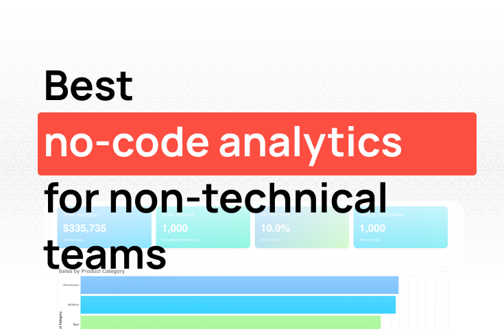
Best no-code data analytics platforms for non-technical teams

TL;DR: Airtable's built-in views show you operational snapshots: record counts, basic charts, filtered views. They don't support trend analysis over time, cross-base queries, or statistical aggregations. Getting real analytics out of Airtable requires connecting Airtable to a query layer. The fastest path: use an AI-native platform like Fabi to query your Airtable data alongside other sources without building a pipeline first.
Airtable sits in an interesting middle ground. It's more than a spreadsheet, but it's not quite a database or a BI tool. Teams use it for everything from project tracking and content calendars to lightweight CRMs and operational runbooks. Its Interface Designer lets you build dashboards on top of your base data, and the formula and rollup field system is genuinely clever.
At some point, Airtable's built-in views stop being enough.
"How has our project completion rate trended over the last six months, by team?" "Which customer accounts in our Airtable CRM have the highest support ticket volume, joined with revenue from our billing system?" "What's the average time from task creation to close, broken down by priority level and assignee?"
Some of these you can hack together in Airtable. But hacking is the operative word. Airtable is an operational tool, and its analytics capabilities were designed for simple summaries, not real analysis. This post covers what Airtable's built-in reporting gives you, where it falls short, and how to get real analytics out of your Airtable data.
Airtable's Interface Designer and native views give you a set of operational summaries:
You can build reasonably polished Interface pages by combining these blocks, a chart block showing counts by status, a summary block with total values, a filtered grid view below it. For operational use cases, it often covers the basics.
Airtable's formula engine handles a surprising amount of date math and conditional logic. If you want to flag overdue tasks, calculate days-to-deadline, or bucket records by category, formulas can do it at the record level. That makes Airtable genuinely useful as an operational database, even if it can't aggregate across it the way a query layer would.
The gaps show up the moment you need to move from "what's the current state?" to "how has this changed over time?" or "what does this mean across systems?"
Charts are static and shallow. Airtable charts show a single aggregation at a point in time. There's no drill-down, no multi-series trend view, no percentile or distribution chart. They're good for a snapshot in a weekly review, not for analysis.
No trend analysis over time. This is one of Airtable's most consistent frustrations. Airtable is great at showing the current state of your data. But "how did this metric change over the last 30, 60, or 90 days?" is hard. There's no native time-series chart that automatically updates to show historical progression, you'd need to structure your base specifically around that, which most bases aren't.
Can't join data across bases. Each Airtable base is its own island. Linked records work within a base, but you can't write a query that joins data from two separate bases. If your project tracking is in one base and your customer data is in another, there's no native way to combine them analytically.
Formula engine isn't designed for analysis. Airtable formulas operate at the record level. There's no concept of window functions, percentiles, running totals, or aggregations across filtered subsets. Complex analytical calculations require exporting data and doing the math elsewhere.
Data volume creates performance problems. Airtable bases start to slow down meaningfully as record counts grow. Once a base has tens of thousands of records, filtering, searching, and loading views takes noticeably longer. It wasn't designed to handle the scale that analytical queries typically require.
None of this is a knock on Airtable. It's an operational database and no-code app platform, not a BI tool. But if your team uses Airtable as the source of truth for operational data, you eventually need a way to actually analyze it.
The goal isn't to replace Airtable's operational views. You still need the kanban board, the filtered grid, the record details. The goal is to add a query layer that can answer the analytical questions Airtable's interface can't handle.
Here's what that looks like in practice:
True trend analysis. Connect Airtable to a query layer and you can build real time-series views, how your metrics have changed week over week and month over month. Task completion rates, project velocity, pipeline movement over time. These update automatically as the underlying Airtable data changes.
Cross-base queries. Pull data from multiple Airtable bases into a single query. If your content calendar is in one base and your content performance data is in another (or in Google Analytics), you can join them to answer questions that neither base can answer on its own.
Real aggregations and statistical analysis. Once your Airtable data is in a query layer, you can apply real SQL: percentiles, standard deviations, cohort logic, running totals, moving averages. "What's the 75th percentile time-to-close for support tasks in the last 60 days?" is a three-second query, not a formula workaround.
Connect Airtable to external systems. Your Airtable CRM or project tracker becomes more useful when joined with data from outside Airtable. Project status in Notion joined with revenue impact from Stripe, or contact records in an Airtable CRM joined with email engagement from HubSpot, these analyses are possible when Airtable data lives in the same query space as your other sources.
Automated reporting for leadership. Instead of manually refreshing Airtable views before every meeting, build a shared dashboard that queries live Airtable data automatically. Leadership can check it on their own without anyone having to export and format data.
Here's a quick comparison of how they stack up:
Export records from each relevant Airtable view. Import into Google Sheets or Excel. Build pivot tables and charts manually. This works for ad hoc analysis. The data is immediately stale, combining multiple exports is tedious, and the output is a one-off workbook that nobody updates after the meeting.
Use Airtable's REST API (or a tool like Fivetran) to sync base records into a data warehouse. Join with other sources and build dashboards in a BI tool. This is scalable and gives you full flexibility. The cost is a real engineering investment: API pagination is finicky, schema changes in Airtable break pipelines silently, and a BI tool adds another layer of licensing and maintenance.
This is the approach we built Fabi around.
Connect Airtable to Fabi and start querying your base data directly alongside other sources.
"Show me the average time from task creation to completion, by team and priority level, for the last 90 days."
"Which records in our Airtable CRM have the highest total contract value, joined with their support ticket count from Intercom?"
"Show me a trend of records added per week by status for the last 6 months."
Fabi generates the SQL, handles Airtable API pagination, and keeps the connection live so dashboards update automatically. You don't write pipeline code.
It also solves the ad hoc problem. When a program manager asks "which team has the worst overdue task rate this quarter?", anyone on the team can get the answer without manually pulling and filtering an Airtable export.
If you're evaluating options, a few things that separate useful tools from ones that collect dust:
Full API access, not just CSV exports. A good tool should sync Airtable data via the API with support for linked record expansion and field-level filtering, not require manual exports that go stale immediately.
Multi-base support. If your data is spread across multiple Airtable bases, the tool needs to query across all of them, not just one at a time.
Cross-source joining. Airtable data rarely lives in isolation. The tool should let you join Airtable records with data from your CRM, billing system, or other sources.
Schema change tolerance. Airtable schemas change frequently as teams add and rename fields. The tool should handle those changes gracefully without requiring manual pipeline updates.
Non-technical usability. The operations manager or program manager who owns Airtable isn't always SQL-fluent. Look for natural language querying or low-code interfaces alongside SQL support for more complex work.
Does Airtable have a dashboard builder? Yes. Airtable's Interface Designer lets you build dashboards using chart blocks, summary blocks, record lists, and other components. These work well for operational snapshots, current-state views for standup or project review. They're not designed for trend analysis, statistical queries, or cross-base analysis.
Can you create charts in Airtable? Yes, with limitations. Airtable supports bar, line, scatter, and pie charts via chart blocks in Interface Designer. They show a single aggregation at a point in time, there's no drill-down, multi-series comparison, or time-series trend view that updates automatically.
Can Airtable join data across multiple bases? Not analytically. You can create synced views that pull records from another base, but there's no native query that joins data across bases for analysis. Cross-base reporting requires exporting to an external tool.
What are Airtable's main analytics limitations? Airtable formulas operate at the record level, no percentiles, running totals, or filtered aggregations. There's no historical trend analysis. Cross-base queries aren't supported natively. Performance also degrades at higher record counts. For a look at no-SQL analytics options that work with tools like Airtable, see how to build dashboards without writing SQL.
Can Airtable connect to external data sources for analytics? Not natively. Airtable has automations that can push or pull data via API and integrations with Zapier or Make. For real cross-source analytics, joining Airtable records with Stripe revenue or HubSpot deal data, you need an external analytics layer.
What is the best analytics tool for Airtable data? For teams wanting to query Airtable data without writing API pipelines, AI-native platforms like Fabi connect via the Airtable API and let you query your bases alongside other sources in plain English or SQL.
Airtable is genuinely useful for managing work and tracking operational data. But the moment you want to analyze that data, find trends, run cohorts, join across systems, build time-series views, you've left what Airtable was designed to do. The data is there. It just needs a query layer to make it useful.
The gap between "how many tasks are open right now?" and "how has task completion rate changed over the last quarter by team?" is where most Airtable users get stuck. You can see the first question in any view. The second requires a real query.
You don't need a warehouse project to get real analytics out of Airtable. Connect your data sources, ask the questions Airtable's interface can't answer, and build the operational analytics view your team actually needs.
Try Fabi free and connect Airtable alongside your other data sources to start querying across everything in minutes.