.svg)


Turn your small business data into decisions with the right dashboard solution that fits your small business needs.

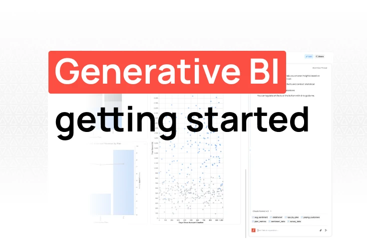
TL;DR: Manual data work wastes hours every week. Traditional automation required hiring expensive data engineers and waiting weeks for custom pipelines. AI-powered workflow automation tools like Fabi.ai eliminate this bottleneck. Here are some of the tools available on the marketplace today and how they compare.
Your VP of Sales just asked for "a quick chart" showing pipeline conversion by source. It's Tuesday at 4 PM. She needs it for Wednesday's exec meeting.
You have the data sitting in your warehouse. You know exactly what she needs. But between here and that chart lies a familiar obstacle course: export to CSV, import to your BI tool, remember which dashboard template to use, fiddle with the axes, fix the colors to match brand guidelines, export as PNG, email it over. Thirty minutes later, she replies: "Can you break this down by region too?"
You start over.
Here's the part nobody talks about: the problem isn't creating visualizations. Modern tools can generate charts just fine. The problem is the workflow around creating them, the endless back-and-forth, the context-switching, the "quick requests" that consume your afternoon.
Data teams know this pain intimately. You've probably accumulated what one PM we talked to called a "dashboard graveyard": dozens of carefully crafted visualizations that nobody looks at anymore because the business question evolved, but the dashboard didn't. Meanwhile, the questions people actually need answered today sit in your Slack DMs, waiting.
AI promises to change this equation. Ask questions in plain English, get charts back in seconds. But here's what most guides won't tell you: not all AI data visualization works the same way, and the differences matter more than the marketing suggests.
This guide breaks down your options. We'll examine AI-native platforms explicitly built for conversational workflows versus traditional BI tools retrofitting AI capabilities. More importantly, we'll show you which workflow problems each approach actually solves and which ones they don't.
AI changes what's possible in three specific ways that matter for your daily work.
First, natural language querying eliminates the need for translation. You ask questions like a human, "Show me Q3 revenue by product line," and get answers without writing code. No SQL required. No remembering which table joins to which.
Second, automated code generation happens in the background. The AI leverages sophisticated Python libraries to create custom visualizations in seconds, handling the technical complexity you'd normally spend hours on.
Third, and perhaps most underrated, AI suggests what to look at next. It identifies patterns you might miss, flags anomalies before you think to check for them, and generates insights from your data without you having to prompt for each one. This shifts visualization from reactive, where you ask and it answers, to proactive, where it surfaces what matters.
The technology enables specific capabilities:
Why does this matter now? Because the gap between data volume and analyst capacity keeps growing. According to industry research, 90% of the world's data was created in just the past two years. Your team isn't growing proportionally. Something has to give.
Traditional BI tools create bottlenecks disguised as solutions. Crafting a new visualization means someone technical preparing a data pipeline from raw data, writing complex queries, choosing the right visualization type, formatting everything correctly, and then doing it all again when the business question inevitably changes.
The people who can do all this remain in short supply. Their calendars are full. Their backlog is long. And your VP of Sales still needs that chart by tomorrow morning.
AI-powered visualization shifts the bottleneck. Instead of routing every request through scarce technical expertise, it acts as a technical partner for whoever needs the insight, whether they write SQL or not.
But, and this is the critical nuance most vendor content skips, how vendors integrate AI into their tools determines whether this promise becomes reality or just creates a different kind of frustration.
Most comparisons frame this as "new vs. old" or "better vs. worse." That's wrong. The real question is: what workflow problem are you trying to solve?
AI-native data visualization tools were designed around a different mental model from the start. Their core assumption: users will have conversations with data, not build artifacts to look at later. This shapes everything: the architecture, the interface, how code is generated and edited, and how results are cached and shared.
Natural language isn't a feature bolted on. It's the primary interface. Code generation, inspection, and editing work as core capabilities, not optional add-ons. The system expects you to iterate, ask follow-ups, and refine results through conversation rather than configuration.
AI-added tools work from a different starting point. These are traditional BI platform tools built for dashboard creation and SQL-based reporting with AI features layered on top. The AI enhances what the platform already does well, but it operates within the constraints of the existing architecture.
This creates specific limitations and specific strengths that most marketing glosses over.
Here's what matters: AI-added tools aren't inherently inferior. They solve different problems and serve different workflows. If your team has years invested in Tableau or Power BI, established dashboard libraries, and processes built around those tools, adding AI capabilities can deliver immediate value without disrupting what already works.
The tradeoff shows up in flexibility and workflow adaptation. AI-native tools excel when your needs are exploratory, conversational, and fast-moving. AI-added tools excel when your needs are structured, repeatable, and built on existing infrastructure.
Consider a specific scenario: your team needs to understand why conversion rates dropped last week. An AI-native tool lets you have a conversation—"Show me conversion by source, now break that down by new vs. returning, now compare to the previous two weeks, now show me just the sources where the drop was significant." Each question builds on the last without configuration changes.
An AI-added tool might answer the first question well, especially if you've already built dashboards around conversion metrics. But the follow-up questions likely require going back to the underlying dashboard, modifying filters, or creating new views. The AI assists, but the workflow remains dashboard-centric.
Neither approach is wrong. But they optimize for different work patterns, and choosing the wrong one for your team's actual workflow creates daily friction.
The key is matching the tool to how your team actually works, not to how vendor demos work or how you think you should work. Both approaches can coexist in your stack, serving different purposes. Understanding the distinction helps you avoid buying the wrong solution for the right price.
These AI data visualization tools were built AI-first, designed for conversational data analysis and data exploration from day one.
These tools were designed AI-first — built for conversational data analysis and exploration from day one, rather than retrofitting AI onto legacy dashboard architectures.
Fabi
Best for: Small and mid-sized teams that need to go from raw data to shared insight without a dedicated data engineering team. Product managers, RevOps, growth marketers, and analysts who have data but not a full BI stack.
Fabi combines text-to-chart with full code transparency. Ask a question in plain English and our AI generates the SQL and Python behind it — you see exactly what it built. Smartbooks merge notebooks with AI-assisted functionality, so analysis doesn't accumulate in a dashboard graveyard. Each Smartbook can be shared, scheduled to send via Slack or email, or published as a live dashboard that updates automatically.
Key capabilities: real-time collaboration between technical and non-technical users, intelligent dependency tracking that prevents breaking changes when data structures update, and data caching to keep warehouse costs predictable. Connectors cover databases directly (Postgres, MySQL, and more) alongside SaaS apps like Salesforce, HubSpot, and Stripe, plus CSV, Excel, and Google Sheets.
The practical impact: Hologram cut time to revenue insights by 94%, from 1-2 days down to 30 minutes. Gauge set up in 10 minutes and reports 80% faster insights. Parasail builds internal reports 10x faster. Aisle reduced analysis time by 92%, with brand managers now answering their own questions through self-service instead of filing requests to the data team.
Pricing: Free tier (25 AI requests/month, 5 Smartbooks). Builder at $39/seat/month. Team at $50/seat/month.
Pros: Code transparency means you see and can edit exactly what the AI generates. Works for both technical users (SQL, Python) and non-technical users (PMs, marketers) in the same environment. Live database connections with automated publishing via Slack and email. Strong free tier to evaluate before committing.
Limitation: Not the right fit if you need a fully mobile-first experience, or if your team has years invested in a legacy BI platform and isn't ready to move off it. The free tier's AI request limits are also restrictive for teams with heavy daily usage.
.webp)
Julius
Best for: Individual analysts, researchers, and founders who need fast exploratory analysis on a specific dataset, without setting up a full analytics environment.
Julius takes a conversational approach: upload a CSV, Excel, or JSON file, then ask questions in plain English. The platform generates Python for each operation — statistical models, visualizations, data transformations — and you can keep asking follow-up questions without starting over. The interface is minimal and the learning curve is low.
It handles a wide range of analysis tasks: summary statistics, distributions, correlations, time series charts, and basic predictive modeling. Popular with analysts preparing investor decks, researchers doing one-off statistical analysis, and growth teams stress-testing a dataset before building out a full analytics workflow.
Pricing: Free tier available. Paid plans from $37/month.
Pros: Near-zero setup — upload a file and start asking questions in minutes. Low learning curve for non-technical users. Handles a wide range of tasks including summary stats, distributions, correlations, and time series without configuration.
Limitation: Works best for individual, file-based analysis. Julius doesn't maintain live database connections, can't join data across multiple sources, and isn't designed for recurring dashboards that update automatically. Analysis tends to stay inside Julius rather than becoming part of a shared team workflow.

Akkio
Best for: Marketing, growth, and RevOps teams that want automated reporting and basic predictive analytics — churn risk, lead scoring, revenue forecasts — without needing a data scientist to build and maintain the models.
Akkio is a no-code AI analytics platform built from the ground up around AI-generated insights. You connect a data source, describe the outcome you want to understand or predict, and Akkio builds the analysis and surfaces results in a shareable dashboard. The conversational analytics layer lets users ask plain-English questions of their data alongside the report builder, covering both historical analysis and forward-looking predictions in one interface.
Where Akkio is distinct from most tools in this list: it's designed explicitly for non-technical teams that want to act on predictions, not just visualize historical data. A sales team can build a weekly pipeline health report with a churn risk layer attached, and update it automatically without involving an analyst.
Pricing: Plans from approximately $49/month. Higher tiers unlock additional models, data sources, and user seats.
Pros: One of the few tools that makes predictive analytics (churn risk, lead scoring, revenue forecasting) accessible without a data scientist. Purpose-built for marketing and RevOps workflows. Automated dashboards update without analyst involvement.
Limitation: Predictive accuracy depends on data quality and volume — models trained on small or noisy datasets have meaningful uncertainty. More configuration than purely conversational tools. Verify current pricing and feature availability before committing, as the platform continues to evolve.

Established platforms that have integrated AI features into existing dashboard and SQL-based architectures. The AI helps, but operates within the constraints of their original design.
Tableau
Tableau's AI features include Ask Data for natural-language queries, Explain Data for automated insights and anomaly summaries, and Einstein Discovery for predictive analytics and forecasting. The strength here is breadth of visualization: Tableau has one of the richest libraries of chart types and has spent years refining the interactive dashboard experience. If your team already has Tableau experts and established dashboard libraries, adding AI capabilities extends what you've already built rather than requiring a wholesale change.
Pricing: From $75/user/month (Creator plan). No free tier.
Pros: Richest visualization library of any tool in this list. Excellent choice if your team already has Tableau expertise and a library of existing dashboards. Most powerful option for complex, custom enterprise visualizations.
Limitation: High cost and a steep learning curve for new users. AI-generated code editing is restricted — you work within Tableau's framework rather than with open, inspectable code. The AI is genuinely useful for asking questions of existing dashboards, but building new visualizations still requires Tableau expertise. Best for teams that already have Tableau in their stack, not a cost-effective starting point.
Power BI
Microsoft's platform offers natural language Q&A, automated insight summaries, and Python/R integration for custom visuals. The most accessible entry point among the major BI platforms on price, especially for organizations already in the Microsoft ecosystem — Azure, Teams, SharePoint, and Excel integrations are seamless. Copilot in Power BI adds conversational analytics capabilities on top of the existing dashboard-building experience.
Pricing: Free desktop version (local only). Pro at $10/user/month for sharing and collaboration. Premium from $20/user/month.
Pros: Best price-to-capability ratio among the major BI platforms. Seamless integration with Excel, Teams, SharePoint, and Azure. Copilot adds natural language querying on top of the existing builder without a major workflow change.
Limitation: Real analytical power requires DAX, Microsoft's formula language, which has a significant learning curve. AI customization is limited compared to AI-native tools. Collaboration requires Pro licenses for everyone involved. The desktop-first workflow feels dated compared to cloud-native alternatives, and complex cross-source data models can become hard to maintain.
ThoughtSpot
ThoughtSpot pioneered search-driven analytics: instead of pre-built dashboards, users type a question into a search bar and get an answer. The Spotter AI layer makes the experience more conversational — follow-up questions, context from prior queries, plain-English summaries alongside charts. SpotIQ handles automated insights, anomaly detection, and forecasting without prompting.
What ThoughtSpot does well is enabling true business-user self-service at scale. A sales manager can ask "which accounts in the Northeast expanded revenue last quarter?" without SQL or dashboard navigation. The trade-off is significant upfront setup: someone technical needs to build and maintain the semantic model before non-technical users can query freely. Once that's done, the experience for end users is genuinely fluid.
Pricing: Essential from $25/month. Pro from $50/user/month. Enterprise custom.
Pros: True self-service at enterprise scale once the semantic layer is built. SpotIQ surfaces automated anomaly detection and insights without prompting. Good fit for large organizations where non-technical business users need to explore data independently.
Limitation: Setup overhead is substantial — accurate AI responses require data modeling work upfront, and the semantic layer needs ongoing maintenance. Total cost at scale is high. Best suited to organizations with a data team who can absorb that configuration work; overkill for small teams without dedicated data resources.
Metabase
The most accessible open-source option in this list. Metabase's visual question builder and straightforward interface let non-technical users explore data without writing SQL — you select a table, apply filters, and choose a visualization type, and Metabase handles the query. The AI layer adds basic natural language search and automated insight suggestions on top of the existing interface.
Self-hosted deployment is free and relatively straightforward. For teams that want to keep their data entirely on their own infrastructure without paying per-user SaaS fees, Metabase is hard to beat. The tradeoff is that someone technical needs to set it up, maintain it, and handle updates.
Pricing: Free (open-source, self-hosted). Cloud plans from $500/month.
Pros: Free self-hosted option is genuinely functional, not just a trial. Simple enough for non-technical users to explore data without SQL. Full data control on your own infrastructure with no per-user SaaS fees.
Limitation: AI capabilities are basic compared to dedicated AI visualization tools — limited natural language conversion, no Python integration, and the AI is more of an enhancement than a core feature. Works well for standard charts and SQL-based dashboards. Falls short for exploratory or advanced AI-powered analysis.
Hex
Best for: Data analysts and engineers who want AI-assisted collaborative notebooks — teams with at least one person who writes SQL or Python and wants to move faster with AI generating code alongside them.
Hex combines SQL, Python, and AI in one collaborative workspace. Write a query, switch to Python for transformation or visualization, use the AI layer to generate code from a plain-English description, then publish everything as a live, interactive app that stakeholders can explore without seeing the underlying queries. It functions like Google Docs for data work: everyone can see, comment on, and build from each other's analyses rather than working in siloed local notebooks.
The AI features are meaningfully integrated rather than bolted on: describe a transformation in plain English and get working Python back, ask the AI to explain a complex query, or let it suggest the right visualization for a given dataset. Technical users work in code; less technical stakeholders interact with the published output.
Pricing: Free tier available. Paid plans for teams — contact for pricing.
Pros: Genuinely collaborative — works like Google Docs for data analysis. Publishes to interactive stakeholder-facing apps without exposing the underlying code. AI code generation is well-integrated rather than bolted on.
Limitation: Requires SQL or Python knowledge to get full value. The AI assists with writing code but doesn't replace technical skills. If your team has no one who can read a query, Hex will feel limited. Also primarily a notebook and app-building environment — not a fully automated dashboard platform.
Deepnote
Deepnote delivers AI-powered collaborative notebooks supporting Python. The platform leverages business context for automatic insights and handles multiple formats through seamless data integration.
Best for: Technical teams wanting a Jupyter-like experience with AI assistance built in. Good for data exploration and creating interactive visualizations from complex information.
Pricing: Free tier available. Team plan from $39/user/month.
Pros: Familiar Jupyter-like environment with AI assistance built in. Good for Python-heavy teams who want real-time collaboration without switching tools.
Limitation: More technically demanding than most tools on this list. Less polished than Hex for publishing output to business stakeholders.
Google Colab
Google recently relaunched Colab as "AI-first" with Gemini integration. A free tier exists for experimentation with basic functionality.
Best for: Python-focused data analysis within the Google ecosystem. Useful for working with spreadsheets and creating graphs, though it requires more technical knowledge than drag-and-drop BI tools.
Pricing: Free. Pro at $9.99/month, Pro+ at $49.99/month.
Pros: Free with Gemini integration. Works well for Python-focused analysis and experimentation within the Google ecosystem.
Limitation: Most technically demanding option in this list. Not designed for business users or recurring dashboards. Requires Python knowledge throughout.
Fabi's AI-native advantage manifests in practice across several dimensions, making it one of the best AI data visualization tools available.
You see exactly what the AI generates. No black boxes. You can modify and refine code as needed. This creates learning opportunities and enables data analysts to scale from data exploration to production by building on existing code. The system maintains accountability while automating complex workflows.
Technical users get exposed code for accuracy checks with version control. Non-technical users access self-serve analytics to answer complex questions and create interactive dashboards with embedded AI chat for follow-up queries.
Coordination and collaboration work smoothly. Shareable Smartbooks let you share work-in-progress with team members and stakeholders. Publishing workflows distribute insights via Slack and email. Its deep integration with Python's top-notch interactive charting libraries creates polished outputs, including graphs and custom visualizations in any format.
Intelligent dependency management tracks relationships automatically across complex datasets. Smart caching prevents runaway costs when querying datasets or working with real-time information. Built-in connectors seamlessly integrate data from multiple databases and apps.
This next-generation approach combines code, Python, and no-code tools in a single scalable environment. Whether you're working with raw information or complex sources, the platform handles preparation, analysis, and visualization with user-friendly interfaces that don't sacrifice advanced analytics power.
Traditional BI tools can still deliver value for established teams with existing infrastructure. Sometimes, however, you need insights now.
AI in data visualization isn't just about prettier charts and graphs. It's about democratizing access and accelerating insights while maintaining analytical rigor, enabling business users to act fast in today's ever-changing market.
The future of data analysis is conversational, collaborative, and code-transparent. Use AI to automate workflows, explore complex datasets through data exploration, and generate interactive visualizations with anomaly detection and forecasting that drive better decision-making. The data visualization tools you choose today will shape how your team works for years to come.
What's the difference between AI-native and AI-added data visualization tools?
AI-native tools were designed from scratch around conversational data analysis. Natural language is the primary interface — you ask questions, get charts, and refine through follow-ups. AI-added tools are traditional BI platforms (dashboards, SQL reports) with AI capabilities layered on top. The AI enhances what the platform already does, but works within the constraints of the original architecture.
Do I need SQL or coding skills to use these tools?
For AI-native tools like Fabi, Julius, and Akkio: no. Natural language is the primary interface. For AI-added tools like Tableau, Power BI, or Hex: some SQL or formula knowledge (DAX for Power BI, Tableau's calculation language) unlocks significantly more capability. Google Colab requires Python throughout.
How much do AI data visualization tools cost?
Free tiers exist for Fabi, Julius, Metabase (self-hosted), Hex, Deepnote, and Google Colab. Paid plans range from $10/user/month (Power BI Pro) to $75/user/month (Tableau Creator). Enterprise tools like ThoughtSpot scale higher depending on usage and data volume.
Which tools connect to live databases?
Most do. Fabi, Tableau, Power BI, ThoughtSpot, Metabase, Hex, and Deepnote all support direct connections to Postgres, MySQL, BigQuery, Snowflake, and other common databases. Julius is file-based only and doesn't maintain live connections. Google Colab requires Python code to establish connections manually. Only Fabi connects directly to applications such as your CRM or event tracking platforms.
Which tool is best for small teams without a dedicated data engineer?
AI-native tools are the natural fit. Fabi and Julius both have free tiers and require no infrastructure setup. Akkio is designed specifically for marketing and RevOps teams. If you need a self-hosted option, Metabase's free open-source version works but does require basic server setup.
What's the difference between AI data visualization and a traditional BI dashboard?
Traditional BI delivers fixed views of pre-prepared data — a dashboard author builds it, and users explore within whatever the author anticipated. AI data visualization lets users ask open-ended questions and get new views on demand, without a data engineer preparing a new pipeline for each request. The practical difference is who can ask questions and how fast they get answers.
Ready to experience AI-native data analytics? Get started with Fabi.ai for free in less than five minutes.