.svg)


CRM analytics beyond your CRM: how to build reports your sales tool can't

TL;DR: For GTM teams that need CRM dashboards combining sales data with billing, product, and marketing data, Fabi.ai is the best option - ask questions in plain English across all your data sources without SQL or a report builder. HubSpot is the strongest all-in-one for SMBs. Salesforce has the deepest native reporting but requires admin expertise. Zoho CRM offers the best value. Pipedrive is ideal for pipeline-focused teams. Monday CRM has the most visual dashboard builder. Fre
A CRM dashboard gives your team a real-time view of pipeline, deals, and sales activity - all in one place instead of scattered across reports and spreadsheets.
That's the theory, at least. In practice, most CRM dashboards only show what's inside your CRM. Pipeline stages, rep activity, deal values, conversion rates between stages. Useful for day-to-day sales management, but not enough for GTM teams that need the full picture.
The questions that actually drive GTM decisions sit at the intersection of multiple systems. "Which lead sources produce the highest LTV, not just the most MQLs?" "Are high-usage trial accounts converting faster?" "What's our real cost to acquire a dollar of expansion revenue?" Your CRM can't answer these because it can only see its own data.
This guide compares eight CRM dashboard tools - from native CRM reporting to cross-source analytics platforms - so you can pick the one that fits how your team actually works.
Before the list, here's what separates a useful CRM dashboard from one that collects dust after a week.
Cross-source visibility. Pipeline data from the CRM, actual revenue from billing, product usage from your database, lead source from marketing. A dashboard limited to CRM data gives you half the picture. GTM teams need to see how these systems connect.
Self-serve access for non-technical users. The growth marketer, PM, or VP of sales shouldn't need to file a ticket every time they want to slice pipeline by segment or check attribution. If only one person on the team can build reports, adoption dies.
Flexible metric definitions. Every company defines "qualified pipeline" or "marketing-influenced revenue" differently. If the tool locks you into its definitions, you'll spend more time working around it than working with it.
Real-time or near-real-time data. Dashboards built on weekly CSV exports are stale before anyone looks at them. The tool should connect to live data or sync frequently enough that you trust the numbers.
Shareable and collaborative. Insights that live in one person's browser tab aren't useful. Saved dashboards, scheduled reports, and the ability to share a link matter more than they sound.
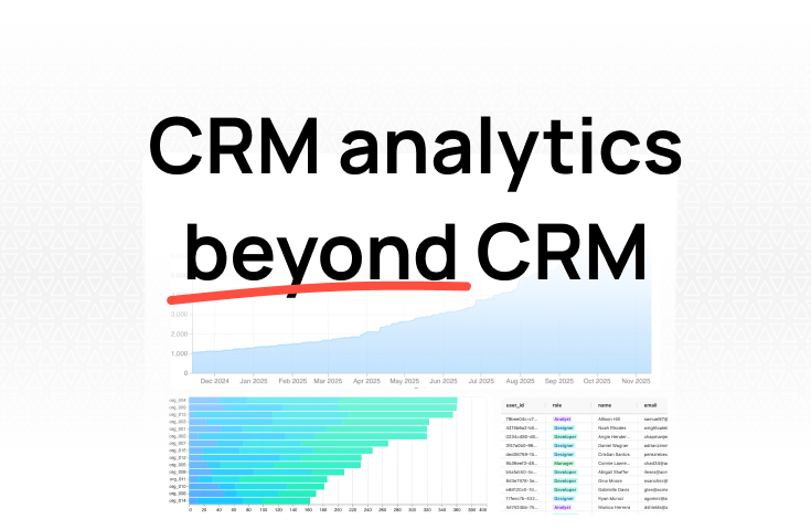
We built Fabi for the problem most CRM dashboards can't solve: answering questions that span multiple data sources.
How it works: Connect your CRM (HubSpot, Salesforce), billing system (Stripe, Chargebee), product database (Postgres, MySQL), and 100+ other sources. Then ask questions in plain English:
"Show me deals closed this quarter alongside product usage in the first 30 days."
"Which customers have declining usage but are up for renewal in 90 days?"
"What's our win rate by lead source, weighted by deal size?"
Every answer shows the SQL behind it - no black box. You can verify the logic, adjust definitions, and save the result as a dashboard that updates automatically.
Why it works for GTM teams:
Where it's less ideal: If your only data source is a single CRM and you don't need cross-source analytics, a native CRM dashboard (HubSpot, Salesforce) may be simpler.
Pricing: Free tier available. Startup-friendly paid plans.
HubSpot is the default CRM for many SMBs and startups, and its dashboard builder is one of the most approachable on the market.
Why it's good:
The biggest advantage for GTM teams is that sales, marketing, and service live in one system. When a campaign generates a lead that becomes a deal, the attribution is native. You don't need to stitch data across platforms to answer "which campaigns generate the most pipeline."
The dashboard builder is drag-and-drop with pre-built templates for pipeline, forecasting, rep activity, and marketing performance. Non-technical users can create and customize dashboards without training. Deal forecasting, pipeline coverage views, and goal tracking are solid on Professional and Enterprise plans.
The free CRM is genuinely usable - small teams can start without committing to paid plans.
Where it falls short:
Advanced reporting is locked behind expensive tiers. Custom reports, calculated fields, and higher dashboard limits require Sales Hub Professional ($90-100/seat/month) or Enterprise ($150/seat/month), plus mandatory onboarding fees ($1,500-$3,500).
HubSpot dashboards only see HubSpot data. Revenue in Stripe, product usage in Postgres, ad spend from platforms outside HubSpot - none of this shows up natively. You need third-party connectors or manual imports.
Custom metrics are constrained by HubSpot's data model. If your team measures pipeline in a way that doesn't map to default deal properties, the workarounds get messy.
Pricing: Free CRM (basic dashboards). Starter from $15/seat/month. Professional from $90/seat/month + $1,500 onboarding. Enterprise from $150/seat/month + $3,500 onboarding.
Salesforce has the most feature-rich reporting and dashboard capabilities of any CRM. If your GTM data lives in Salesforce, there's a lot you can do without leaving the platform.
Why it's good:
The report builder supports cross-object reporting (accounts, contacts, opportunities, custom objects), scheduled delivery, role-based visibility, and dynamic filters. For RevOps teams with a well-structured Salesforce instance, the depth is unmatched among native CRM tools.
CRM Analytics (formerly Einstein Analytics) adds AI-driven insights, predictive scoring, and advanced visualizations for teams on Enterprise or Unlimited plans. The AppExchange ecosystem lets you extend reporting with hundreds of add-ons.
Real-time dashboards with auto-refresh, embedded charts on record pages, and mobile-optimized views make it practical for field teams and leadership alike.
Where it falls short:
The report builder is powerful but not intuitive. Building custom reports requires understanding report types, cross-filters, bucket fields, and formula fields. Most teams rely on a Salesforce admin to build and maintain dashboards - self-serve for most users it is not.
Salesforce dashboards only see Salesforce data. Billing, product usage, and marketing attribution from external tools require integrations or manual syncing.
Hard limits exist: 2,000 rows in formatted reports, charts capped at 250 groups. Lower-tier plans have significantly reduced reporting. The best features require Enterprise ($165/user/month) or higher.
Pricing: Starter from $25/user/month. Professional from $80/user/month. Enterprise from $165/user/month. Unlimited from $330/user/month. CRM Analytics is an add-on.
Zoho CRM packs a surprising amount of reporting and dashboard capability at price points well below Salesforce or HubSpot's paid tiers.
Why it's good:
Out of the box, Zoho CRM includes 100+ pre-built analytics reports and dashboards. The Standard plan ($14/user/month) already includes custom dashboards and reporting - features that competitors lock behind plans two or three tiers higher.
Zoho Analytics, available as a standalone product or bundled with the Ultimate CRM plan ($52/user/month), adds a full BI layer on top. You can combine CRM data with data from other Zoho apps (Zoho Books, Zoho Desk, Zoho Campaigns) for a more complete GTM view - if your stack is Zoho-native.
The dashboard builder supports drag-and-drop widgets, heatmaps, KPI cards, funnels, and cohort views. Zia, Zoho's AI assistant, can answer basic questions about your CRM data in natural language.
For cost-conscious teams that need solid CRM dashboards without enterprise pricing, Zoho is hard to beat.
Where it falls short:
Cross-source analytics outside the Zoho ecosystem is limited. If your billing runs on Stripe and your product database is Postgres, Zoho Analytics can connect to them, but setup is more involved than connecting Zoho-native apps.
The UI is functional but dated compared to HubSpot or Monday. It gets the job done, but the experience isn't as polished.
Advanced features require navigating Zoho's product sprawl - Zoho CRM, Zoho Analytics, Zoho CRM Plus, Zoho One - and figuring out which bundle includes what you need takes more research than it should.
Pricing: Standard from $14/user/month. Professional from $23/user/month. Enterprise from $40/user/month. Ultimate from $52/user/month (includes Zoho Analytics).
Pipedrive was built around the visual pipeline, and its dashboards reflect that focus. If your GTM team lives and breathes pipeline stages, Pipedrive keeps things simple and visual.
Why it's good:
The kanban-style pipeline view is Pipedrive's signature - intuitive drag-and-drop deal management that doubles as a dashboard. You see every deal, its stage, and its value at a glance. Multiple pipelines for different products, regions, or sales motions are easy to set up.
The Insights dashboard lets you pin up to 25 reports with drag-and-drop layout. Pre-built reports cover pipeline performance, deal conversion, activity tracking, and revenue forecasting. Managers can filter by rep, time period, or pipeline in a few clicks.
Pipedrive's AI Sales Assistant surfaces daily performance snapshots and flags deals at risk of stalling. For small to mid-size sales teams that want clear pipeline visibility without complexity, the experience is streamlined.
Pricing is straightforward and accessible. The Essential plan starts at $14/user/month, and even the top-tier Enterprise plan ($79/user/month) is cheaper than mid-tier plans from Salesforce or HubSpot.
Where it falls short:
Pipedrive is a sales tool, not a GTM analytics platform. Dashboards are focused on pipeline and deals. Marketing attribution, product usage, and customer success metrics aren't part of the native experience.
Reporting depth is limited compared to Salesforce or HubSpot Enterprise. Complex cross-object reports or custom calculated fields aren't available. If your RevOps team needs to slice data in non-standard ways, you'll hit a ceiling quickly.
Integrations exist but analytics capabilities don't extend beyond CRM data natively. For cross-source dashboards, you'll need a separate analytics layer.
Pricing: Essential from $14/user/month. Advanced from $29/user/month. Professional from $49/user/month. Enterprise from $79/user/month. Billed annually.
Monday CRM brings Monday.com's visual, widget-based approach to CRM dashboards. If your team values flexibility in how data is displayed, Monday gives you more layout options than most CRMs.
Why it's good:
Unlimited dashboards on all plans - a notable differentiator when other CRMs cap dashboard count by tier. Each dashboard supports drag-and-drop widgets: charts, gauges, batteries, tables, calendars, Gantt views, numbers, and more.
Dashboards can pull data from up to 50 boards (on higher plans), which means you can consolidate CRM data with project management, customer onboarding, or marketing boards in a single view. For GTM teams that use Monday.com for more than just sales, this cross-board visibility is genuinely useful.
The interface is colorful and approachable. Non-technical users can build dashboards without help, which drives adoption across the team - not just among RevOps.
Native email sync, automations, and a structured activity timeline round out the CRM features. Pricing starts at $12/user/month (3-seat minimum), making it accessible for small teams.
Where it falls short:
Monday CRM is relatively new compared to HubSpot or Salesforce. The reporting engine is improving but lacks the depth of mature CRM platforms. Advanced sales analytics - cohort analysis, multi-touch attribution, custom calculated metrics - aren't strengths yet.
Cross-board dashboards are useful within Monday's ecosystem, but connecting external data (billing, product databases) still requires integrations or workarounds.
The 3-seat minimum on all plans means a solo user or two-person team pays for three.
Pricing: Basic from $12/user/month. Standard from $17/user/month. Pro from $28/user/month. Enterprise by quote. All plans require 3-seat minimum, billed annually.
Freshsales (by Freshworks) combines a clean CRM with AI-powered deal insights at price points that undercut most competitors.
Why it's good:
Freddy AI is the standout feature. It analyzes deal activity - emails, calls, stage changes - and categorizes opportunities into health buckets: At risk, Trending, Likely to close, and Gone cold. The dashboard surfaces these insights visually, so reps and managers can focus on the right deals without manual pipeline reviews.
Pre-built dashboard templates populate automatically with your sales data. Pipeline views, rep activity reports, and revenue forecasting are available out of the box. The interface is clean and uncluttered - closer to Pipedrive's simplicity than Salesforce's complexity.
The Forever Free plan is genuinely functional for very small teams. The Growth plan ($11/user/month) adds custom dashboards. Pro ($47/user/month) and Enterprise ($71/user/month) unlock advanced reporting and AI capabilities.
Built-in phone, email, and chat mean activity data flows into dashboards automatically - no integration needed for core sales communications.
Where it falls short:
Reporting depth on lower tiers is limited. Custom dashboards and advanced analytics require Pro or Enterprise plans.
Like other native CRM dashboards, Freshsales only sees Freshsales data. Billing, product usage, and marketing tools outside the Freshworks ecosystem need third-party connectors.
The platform is less established than HubSpot or Salesforce. The integration ecosystem is smaller, and finding third-party resources (consultants, templates, community support) is harder.
Pricing: Free plan available. Growth from $11/user/month. Pro from $47/user/month. Enterprise from $71/user/month. Billed annually.
Databox takes a different approach. Instead of being a CRM, it's a dashboard platform that pulls data from your CRM alongside 130+ other cloud sources into a unified reporting layer.
Why it's good:
If your GTM stack includes HubSpot, Google Analytics, Facebook Ads, Stripe, and a handful of other tools, Databox can pull key metrics from all of them into a single dashboard. You get a consolidated view without switching between five different reporting tools.
The drag-and-drop dashboard builder is straightforward, with pre-built templates for common use cases (sales pipeline + marketing metrics, CRM + ad spend). Goals tracking lets you set targets and monitor progress across sources. Smart alerts notify you when metrics hit thresholds or deviate from benchmarks.
Benchmarks are a unique feature - compare your metrics against anonymized data from similar companies to see where you stand. Useful for GTM leaders who want to contextualize their numbers.
Pricing is per-data-source rather than per-user, with unlimited users on all plans. For larger teams, this can be more cost-effective than per-seat CRM tools.
Where it falls short:
Databox is a reporting layer, not an analytics tool. You can visualize metrics, but you can't run custom queries, do ad hoc analysis, or ask questions the pre-built connectors don't support. If a metric isn't available through the integration, you can't get it.
Starting at $199/month (or $159/month annually), it's a meaningful cost on top of the CRM and other tools you're already paying for. For small teams, the ROI may not justify the additional expense.
Cross-source analysis is limited to the metrics each integration exposes. You can put HubSpot pipeline and Stripe revenue on the same dashboard, but you can't join them - you can't ask "what's the actual collected revenue for deals from this lead source." For that, you need a tool that can query across sources, not just display them side by side.
Pricing: Professional from $199/month ($159/month annually, 3 sources). Growth from $399/month ($319/month annually). Premium from $999/month ($799/month annually, 100 sources). All plans include unlimited users.
You need to combine CRM data with billing, product, or marketing data. Start with Fabi. It's the only tool on this list that lets you query across data sources in plain English without engineering support. When someone asks "what's our actual collected revenue by lead source?" you answer in seconds.
You're an SMB that wants sales, marketing, and CRM in one platform. HubSpot gives you the most integrated GTM view with the least integration work. Budget for Professional if you need real reporting.
You're a Salesforce shop with a dedicated admin. Lean into Salesforce's native dashboards. The reporting is deep - but you'll need someone who knows how to build and maintain it.
You want solid CRM dashboards at the lowest cost. Zoho CRM packs more dashboard capability per dollar than any other option. It's not the prettiest, but the value is real.
Your team is pipeline-obsessed and wants simplicity. Pipedrive's visual pipeline and lightweight reporting are ideal for teams that don't need complex analytics.
Your team values visual customization and already uses Monday.com.Monday CRM's widget-based dashboards are the most flexible for non-technical users who want to design their own views.
You want AI-powered deal insights without enterprise pricing. Freshsales' Freddy AI surfaces deal health and risk signals at a fraction of what competitors charge.
You want one dashboard layer across your entire GTM stack. Databox consolidates metrics from 130+ sources. Good for visibility, but limited for deep analysis.
Most CRM dashboards show you what's in your CRM. That's useful but incomplete. The decisions that actually move GTM performance - where to invest, which segments to prioritize, what's really driving revenue - require data from across your stack.
Pick the tool that matches where your data lives and how your team works. If a single CRM covers your needs, use its native dashboards. If the important questions span multiple systems, choose something built for cross-source analytics.
Try Fabi free - connect your CRM alongside billing, product, and marketing data and build your first cross-source dashboard in minutes.