.svg)


Marketing dashboard: what it is and how to build one in 6 steps

TL;DR: For marketing and GTM teams that need to combine data across channels and connect marketing activity to pipeline, Fabi.ai is the best option — ask questions in plain English across all your data sources without SQL or data engineering. HubSpot works well if your entire GTM stack already lives there. Databox is strong for multi-channel tracking with 130+ integrations and pre-built templates. Looker Studio is free and flexible but requires more manual setup. DashThis is the simplest option for clean marketing reports.
Marketing and GTM teams share a problem: the data they need to make decisions is spread across too many tools.
Google Analytics has traffic data. Google Ads and Meta have campaign performance. HubSpot or Salesforce has leads and pipeline. Stripe or your billing system has revenue. And the question everyone actually wants answered — "which marketing activities are driving revenue?" — requires stitching all of it together.
Most marketing dashboard tools solve only part of this. They'll show you ad performance or website traffic or email metrics. But connecting a blog post to a lead to a closed deal to revenue? That usually involves a spreadsheet, three exports, and a prayer.
GTM teams have it worse. They need marketing and sales data in the same view — pipeline velocity alongside campaign performance, attribution across the full funnel, not just the top.
Here are five marketing dashboard solutions that serve these needs, with honest assessments of what each does well and where it doesn't.
Before the list, here's what separates a useful marketing dashboard from another tool collecting dust.
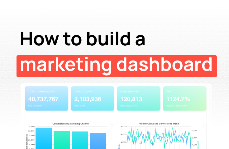
Cross-channel visibility. You're running organic, paid, email, and maybe events. A dashboard that only shows one channel forces you to switch tools to get the full picture. The tool should pull from all your marketing platforms into a single view.
Connection to pipeline and revenue. This is the big one. Traffic and leads are inputs. Pipeline and revenue are outcomes. A marketing dashboard that can't connect the two leaves you reporting on activity instead of impact. GTM teams especially need this — the whole point is aligning marketing spend with sales results.
Low setup cost. If it takes two weeks and a data engineer to configure, it's a BI project, not a marketing dashboard. The tool should connect to your existing platforms and deliver value within a day.
Ability to investigate. Dashboards show you that something changed. Good tools let you figure out why. When conversion rate drops, can you filter by channel, campaign, or landing page without building a new report?
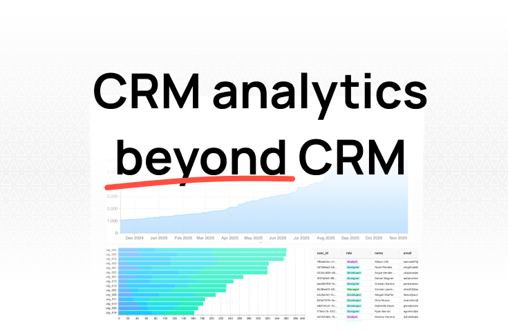
We built Fabi for teams that need to answer questions across multiple data sources — without writing SQL or setting up data pipelines.
How it works: Connect your marketing stack — Google Analytics, HubSpot, Salesforce, Stripe, Snowlake, and 100+ others. Then ask questions in plain English:
"What's our CAC by channel for the last two quarters?"
"Which campaigns generated the most pipeline this month?"
"Show me conversion rate from MQL to closed deal, broken down by lead source."
"Do blog-sourced leads close at a higher rate than paid ads?"
Every answer shows the SQL behind it, so you can verify the logic and adjust if needed.
Why it works for marketing and GTM teams:
Where it's less ideal: If you primarily need a static weekly report to send to clients (like an agency), a tool built specifically for report delivery like DashThis is more focused on that workflow.
Pricing: Free tier available. Startup-friendly paid plans.
If your marketing, sales, and CRM data already live in HubSpot, their built-in dashboards are the lowest-friction option for GTM visibility.
Why it's good:
The biggest advantage is that there's nothing to connect. If your team uses HubSpot Marketing Hub and Sales Hub, your marketing campaigns, leads, deals, and revenue are already in the same system. Building a dashboard that shows marketing activity alongside pipeline is straightforward because HubSpot owns the full data model.
Attribution reporting is built in. You can see which touchpoints influenced a deal — first touch, last touch, or multi-touch — without setting up a separate attribution tool. For GTM teams trying to understand which marketing activities drive pipeline, this is valuable out of the box.
The template library is extensive. Pre-built dashboards for marketing performance, sales pipeline, and revenue attribution mean you can get a working dashboard in under an hour.
Where it falls short:
HubSpot dashboards only see HubSpot data. If you run Google Ads through Google's platform (not HubSpot's ads tool), that data isn't natively in your dashboard. Same for Stripe revenue, product usage data, or any source outside the HubSpot ecosystem. You can work around this with third-party connectors or manual imports, but it breaks the "single source of truth" promise.
Advanced reporting features are gated behind expensive plans. The free and Starter tiers give you basic dashboards. Custom reports, advanced attribution, and higher dashboard limits require Professional ($800/month) or Enterprise ($3,600/month). For a small business, that's a significant investment for dashboarding alone.
Customization has limits. You can build reports on HubSpot's data model, but if you need a metric that doesn't fit their structure, or want to combine HubSpot data with external sources in the same chart, you'll hit walls.
Pricing: Free (basic dashboards). Professional from $800/month. Enterprise from $3,600/month. Pricing is for Marketing Hub — dashboard features are bundled with the broader platform.
Databox has built a strong reputation as a marketing dashboard tool, primarily because of its breadth of integrations and template library.
Why it's good:
130+ native integrations cover most of the marketing stack — Google Analytics, Google Ads, Meta Ads, LinkedIn Ads, HubSpot, Salesforce, Mailchimp, and dozens more. For a marketing team running campaigns across five or six platforms, Databox can pull it all into one view without middleware.
The pre-built templates are genuinely useful for getting started. Pick a "Google Ads performance" or "marketing funnel" template, connect your accounts, and you have a working dashboard in minutes. For teams that want standard marketing metrics without building from scratch, this is a fast path.
Goal tracking and benchmarking are standout features. Set a target for leads this month, and Databox shows you real-time progress against that goal. Benchmarking lets you compare your metrics against anonymous data from similar companies — useful for knowing whether your conversion rate is strong or just average.
The mobile app updates in real time and is well-designed. If your marketing lead wants to check performance from their phone, Databox handles that better than most.
Where it falls short:
The free tier limits you to three data sources. Most marketing teams have more than three. Paid plans start at $72/month, and each additional data source beyond your plan's limit costs $5.60/month. A team connecting Google Analytics, Google Ads, Meta Ads, HubSpot, and Salesforce is already at five sources.
Cross-source analysis is limited. Databox can display metrics from multiple sources on the same dashboard, but it can't easily combine data across sources. "Show me CAC by channel where the revenue comes from Stripe and the ad spend comes from Google Ads" — that kind of cross-source query isn't something the tool handles natively.
Customization beyond templates requires their "Datasets" feature, which has a learning curve. If the pre-built metrics cover your needs, Databox is fast. If you need custom calculations, it gets more complex.
Pricing: Free (3 data sources). Professional from $72/month. Growth from $231/month. Additional connectors $5.60/month.
Looker Studio (formerly Google Data Studio) is Google's free reporting and dashboard tool. For marketing teams that live in the Google ecosystem, it's a strong default.
Why it's good:
Native connectors to Google Analytics, Google Ads, Google Sheets, and BigQuery are free, fast, and reliable. If your primary marketing channels are organic search and Google Ads, you can build a comprehensive marketing dashboard without spending anything.
Design flexibility is the best on this list. Full control over layout, colors, fonts, and chart types. Marketing teams that care about how their dashboards look for stakeholder presentations will appreciate this.
600+ partner connectors mean you can technically connect almost any data source. And there are no user limits — share dashboards with your entire company at no extra cost.
Calculated fields let you create custom metrics directly in the dashboard. Blended data sources allow you to combine up to five sources in a single chart — useful for comparing ad spend across platforms or combining traffic data with CRM conversions.
Where it falls short:
The "free" part only applies to Google-native data. Connecting HubSpot, Meta Ads, Salesforce, or other non-Google sources requires third-party connectors (Supermetrics, Funnel.io, etc.) that cost $29-$300+/month each. A marketing team connecting three non-Google sources could spend more than a paid dashboard tool.
Performance degrades with complexity. Dashboards with many data sources, large date ranges, or numerous widgets become slow. Google Analytics 4 has API quota limits that can cause reports to break during periods of heavy use.
The learning curve is steeper than dedicated marketing tools. Looker Studio is a general-purpose reporting builder, not a marketing-specific tool. There are no marketing-focused templates or pre-built metrics — you configure everything manually.
There's no AI or natural language querying. Every dashboard is hand-built. When a number moves unexpectedly, investigating means modifying the report or building a new one.
Pricing: Free (Google connectors). Third-party connectors $29-$300+/month each.
DashThis is a marketing reporting tool built specifically for creating clean, client-ready marketing dashboards with minimal effort.
Why it's good:
DashThis is the least complicated tool on this list, and that's its strength. Connect your marketing platforms, pick a template or drag in preset widgets, and you have a clean marketing dashboard. The interface is straightforward enough that a marketing coordinator can set up a dashboard without training.
34+ native marketing integrations cover the core platforms: Google Analytics, Google Ads, Meta Ads, LinkedIn Ads, Mailchimp, Semrush, Moz, and others. Not the broadest list, but it covers what most marketing teams actually use.
Pricing is based on dashboard count, not users or data sources. Every plan includes unlimited integrations and unlimited users. For a team that needs 3-5 dashboards with data from multiple sources, the cost is predictable and straightforward.
The AI Insights feature (free on all plans) automatically surfaces wins, issues, and opportunities from your data — a simple way to spot trends without manually scanning every metric.
White-labeling and automated report delivery make it popular with agencies. But in-house marketing teams benefit from the same simplicity. Build it once, share a link, and it stays current.
Where it falls short:
DashThis is designed for reporting, not analysis. You can see your metrics, but you can't drill into them. When conversion rate drops, DashThis will show you the drop. It won't help you figure out which campaign, landing page, or audience segment caused it.
The 34 integrations are more limited than Databox (130+) or Looker Studio (600+). If your stack includes less common tools, you may need Zapier or manual CSV imports to fill gaps.
There's no connection to CRM or revenue data in a meaningful way. DashThis shows marketing channel metrics well, but it can't connect those metrics to pipeline or closed revenue. For GTM teams that need full-funnel visibility, this is a significant limitation.
Customization is restricted. Layout options and chart types are more limited than Looker Studio or Databox. What you gain in simplicity you lose in flexibility.
Pricing: Individual $49/month (3 dashboards). Professional $149/month (10 dashboards). Business $289/month (25 dashboards). Standard $479/month (50 dashboards).
You need to connect marketing activity to pipeline and revenue.Start with Fabi. It's the only tool on this list that lets you ask cross-source questions — combining ad spend with CRM pipeline with billing revenue — without engineering support. When your CEO asks "what's our CAC by channel?" you get the answer in seconds, not days.
Your entire GTM stack is already in HubSpot.Use HubSpot's built-in dashboards. No integration friction, attribution is native, and your marketing and sales data is already unified. Just be ready for the Professional/Enterprise upgrade when you need advanced reporting.
You're running 5+ marketing channels and want quick visibility.Databox gives you the broadest integration coverage and the fastest path from zero to a multi-channel marketing dashboard. The templates get you started; the goal tracking keeps your team accountable.
You're in the Google ecosystem and budget is tight.Looker Studio is free for Google-native data and gives you more design control than any other tool here. Budget for third-party connectors if you need non-Google sources.
You want the simplest possible marketing report.DashThis gets you a clean, shareable dashboard with the least amount of setup. Good for teams that need visibility into channel metrics without the complexity of cross-source analysis.
The best marketing dashboard is the one that answers your team's actual questions — not just "how much traffic did we get?" but "which activities drove revenue and where should we invest next?" Start with the questions that come up every week, pick the tool that can answer them from your existing data, and build from there.
Try Fabi free — connect your marketing data sources and build your first dashboard in minutes, not weeks.