
.svg)


Best starter BI solutions for small and growing startups

TL;DR: You’ve built your app on Supabase and are shipping features fast with vibe coding platforms like Lovable, Replit, or V0. But now comes the real question: what are users actually doing in your app? Traditional analytics tools like Mixpanel or Amplitude are slow, complex, and built for enterprises—not for modern, fast-moving developers. Fabi changes that. It’s AI-powered product analytics that connects directly to your Supabase database, letting you ask questions in plain English and instantly visualize insights—no SQL, SDKs, or setup headaches.
You've built your app with Supabase. You're shipping features fast with the power of AI in your favorite vibe coding platform such as Lovable, V0 or Replit. Users are signing up. But here's the question keeping you up at night: what are they actually doing in your app? Where are they getting stuck? Which features are driving growth, and which ones are collecting digital dust? I’ve been a product manager for over 10 years now, and I know that these are always the same questions I wrestle with.
Traditional analytics tools promise answers, but they come with a catch: complex setup processes, steep learning curves, and weeks of configuration before you see your first insight. If you're part of the vibe coding movement, building rapidly with tools like Lovable, Replit, or V0, this feels completely backwards. You can ship a feature in an afternoon—why should analytics take a week to set up?
We created Fabi with one simple idea: AI-powered product analytics that matches the speed and simplicity of modern development. In this guide, you'll learn how to connect your Supabase database to Fabi and start getting actionable insights in minutes. Whether you're tracking user behavior, monitoring growth metrics, or trying to understand your conversion funnel, you'll be asking questions and getting answers faster than you ever thought possible.
And if you’re a visual learner and would prefer to follow along with a video, check out our tutorial on YouTube:
Supabase has become extremely popular with the rise of vibe coding. Whether you're using Lovable to generate full-stack apps, spinning up prototypes in Replit, or designing with V0, Supabase is the database that just works. No complex configuration, no DevOps headaches—just a PostgreSQL database with auth, storage, and real-time features built in.
These tools have revolutionized how we build products. You can go from idea to deployed app in hours instead of weeks. So here's the natural question: why should analytics be any different? If you can ship a feature before lunch, you should be able to understand how users interact with it by dinner. That's where vibe analytics comes in—analytics that matches the speed and developer experience you're used to with modern tools.
Most folks using Supabase are building real products that you’re putting out to the world. If this sounds like you, if you’re getting some traction, you’re probably asking yourself questions about your user base and product, such as:
Understanding user behavior: Are people actually using the feature you spent two weeks building? What's the typical user journey through your app? Where do power users spend their time versus casual users?
Identifying friction points: You're seeing signups, but where are users dropping off? Is it during onboarding? After the first session? When they try a specific feature?
Tracking feature adoption: You launched a new feature—is anyone using it? Which user segments are adopting it fastest? Should you double down or pivot?
Monitoring growth and retention: How many users come back after their first session? What's your week-over-week growth looking like? Are you building a leaky bucket or a growth engine?
Making data-driven decisions: Should you prioritize feature A or feature B? Is that new pricing strategy working? What's the ROI on your latest marketing campaign?
These aren't abstract questions. They're the difference between guessing and knowing, between spinning your wheels and accelerating growth.
I also want to take a moment to address a question you may have at this point: Are there not product analytics and event tracking platforms, like Mixpanel, Amplitude and PostHog designed specifically to answer these questions? Sort of… I’ve been using these tools my entire career, and they’re fantastic when it comes to tracking events like clicks, sign-ups etc. But a lot of questions about your product don’t fit in this category. Let’s take a very practical example. Let’s say you’re an awesome, next-gen AI-native BI platform (sounds a lot like Fabi doesn’t it?) and you want to know the average number of published data workflows by user. You may have an event in your other product analytics tool that tells you how many workflows were published, but that’s not the same as looking at how many are currently published. The answer to that question is a simple query on the records you have powering your application.
Hopefully at this stage it’s clear why you need to be able to pull numbers based on your production data, and you might be thinking, "Can't I just use [insert traditional BI tool]?" Sure, you could. But here's what you're signing up for:
Traditional business intelligence tools were built for enterprise data teams, not indie hackers and startup founders. They require extensive setup—configuring data models, building dashboards from scratch, writing SQL queries for every question. You'll spend days learning their interface before you see your first insight.
These tools assume you know exactly what you want to track before you start. They make you commit to specific dashboards and metrics upfront. But here's the reality of building products: you don't know what questions you'll need to ask until you're in the thick of it. Your analytics tool should adapt to your questions, not force you to adapt to its limitations.
Then there's the complexity barrier. Want to see user retention? Better know how to write a cohort analysis query. Curious about conversion rates? Hope you're comfortable with window functions and CTEs. These tools gatekeep insights behind SQL expertise, which means either learning a new skill or hiring a data analyst.
And let's talk about cost. Enterprise BI tools come with enterprise price tags. Monthly fees that scale with users, data volume, or queries. For early-stage builders, this pricing model is completely backwards—you need analytics most when you can afford it least.
Finally, there's the experience gap. These tools feel like they're from a different era of software—clunky interfaces, endless configuration screens, and workflows designed for weekly board meetings rather than daily product decisions. They're missing the "vibe" entirely.
As a founder, I’m not working insane hours for a small vision. We believe that generative BI that completely rethinks how data analysis is done is the future.
Here’s how we believe Bi should actually work:
AI data visualization changes everything. Instead of wrestling with query builders and drag-and-drop chart makers, you simply ask questions in natural language. "Show me user signups over the last 30 days." "Which features are most used by active users?" "What's the conversion rate from signup to first purchase?"
Fabi's conversational interface understands what you're asking and generates the right visualization automatically. No SQL required. No dashboard configuration. No watching tutorial videos to figure out which buttons to click. Just ask and get answers.
The AI remembers context, so you can have a real conversation with your data. Ask a question, then drill deeper with follow-ups. "Now break that down by acquisition channel." "Show me just the last 7 days." "How does that compare to last month?" This is how you actually think about data—exploratory, iterative, curious. Finally, there's a tool that matches that workflow.
And because you're connecting directly to your Supabase database, there's no data pipeline to build, no events to instrument, no SDKs to integrate. Your data is already there. Fabi just helps you understand it.
This is analytics built for the way you work: fast, intuitive, and powerful. Vibe coding meets vibe analytics. Let's get you set up.
Let’s dig in and see how you can analyze your production data with Supabase and Fabi in minutes.
What You'll Need:
Before we begin, make sure you have:
Step 1: Gather Your Supabase Credentials
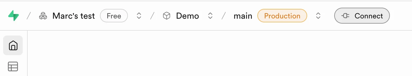
First, let's get your database connection details from Supabase. Log into your Supabase dashboard and navigate to your project. Select the branch you want to connect to Fabi then hit Connect next to the branch name.
Important note: Look for the credentials for a connection type that supports IPv4.
I cover this in the the video below (unfortunately I had to blur out most of the screen for security purposes, but I talk through where to go and the section of the video leading up to this chapter illustrates how to get there).
Here's what you're looking for:
Host: This is your database URL, something like db.{unique_id}.supabase.co
Database name: Usually postgres unless you've customized it
Port: This will be 5432 (the standard PostgreSQL port) or 6543 if you're using connection pooling
User: Typically some unique string
Password: This is the database password you set when creating your project. If you've forgotten it, you can reset it from this same settings page.
You can find all of these details in the "Connection string" section. Supabase helpfully provides both the URI format and the individual parameters. Copy these somewhere safe—you'll need them in just a moment.
A quick note on security: Fabi uses encrypted connections to your database and never stores your password in plain text. For extra peace of mind, you can also configure Fabi to connect with read-only access, ensuring it can query your data but never modify it. We'll cover this option in Step 3.
Step 2: Add Supabase as a data source in Fabi
Now let's jump over to Fabi. Log into your Fabi account and look for the "Data Sources" on the left hand side of any Smartbook . Click it, and you'll see a list of supported databases.
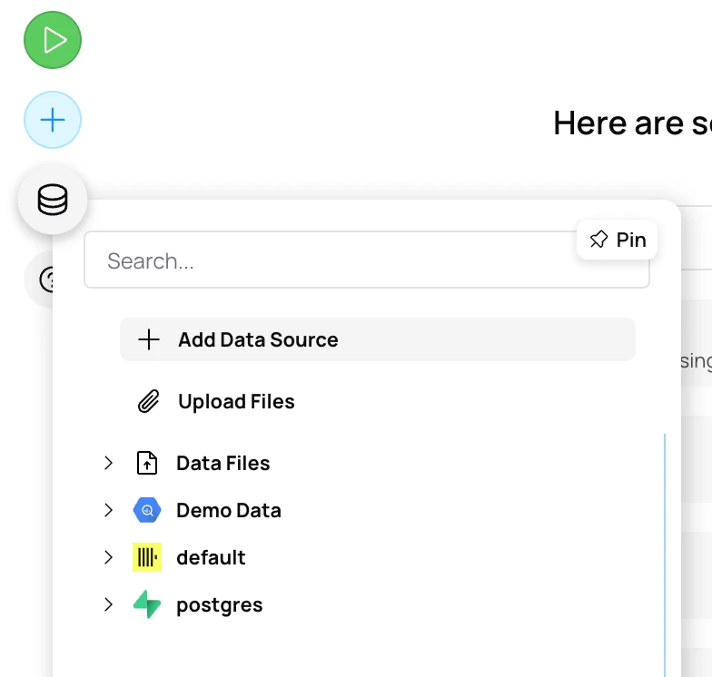
Select "Supabase" from the list.
Step 3: Enter Your Connection Details
You'll now see a connection form. This is where those Supabase credentials come into play. Fill in the fields with the information you gathered in Step 1:
Host: Paste your Supabase database URL
Port: Enter 5432 (or 6543 if using pooler)
Database: Enter postgres or your custom database name
User: Enter postgres or your specific user
Password: Enter your database password
Before clicking "Connect," you have a couple of optional configurations worth considering:
Once you've entered everything, click the "Submit" button. Fabi will attempt to connect to your Supabase database and verify that all the credentials are correct. If everything's working, you'll see a success message. If not, double-check your credentials—the most common issues are typos in the host URL or using the wrong password.
Connection complete!
You should see a confirmation message letting you know that Fabi is now connected to your Supabase database, and you will also receive an email. Congratulations! You've just crossed the biggest hurdle. Your data is now accessible, and you're seconds away from your first insight.
Quick troubleshooting: If you run into connection issues, here are the most common culprits:
And remember, if you want to see all of this in action, check out the YouTube tutorial for a complete visual walkthrough.
Here's where things get fun. Unlike traditional BI tools where you'd now spend hours building dashboards and configuring charts, Fabi lets you start asking questions immediately. The AI understands natural language, identifies the relevant data, and generates visualizations automatically.
The Power of Conversational Analytics
Think about how you'd explain what you want to know to a colleague. "Hey, how many users signed up last week?" or "Which features are people actually using?" That's exactly how you interact with Fabi. Our AI Analyst Agent automatically generates the block(s) of SQL or Python to answer your questions, no matter how simple or complex.
The magic happens behind the scenes. When you ask a question, Fabi's AI analyzes your database schema, understands the relationships between tables, figures out which data you need, and generates both the query and the appropriate visualization. You see the insight. The AI handles the complexity. The power of Fabi is also that you can explore the code at any point and edit it if you want.
Let's walk through some real examples to show you what's possible.
Example Question 1: User Growth
Let's start with a fundamental question for any product: how is user growth trending?
Simply type into Fabi: "Show me user signups over the last 30 days"
Here's what happens next. Fabi examines your users table, identifies the signup date column (whether it's called created_at, signup_date, or something else), filters for the last 30 days, and counts users by day. Within seconds, you'll see a line chart showing your daily signups.
What should you look for? The overall trend tells you if you're growing consistently, accelerating, or plateauing. Look for spikes—those might correspond to a product launch, marketing campaign, or press mention. Look for dips too—those could indicate technical issues, bad PR, or seasonal patterns.
Let's say you notice a big spike on October 1st. You can immediately follow up with: "What happened on October 1st? Show me signups by source." Fabi remembers the context and will break down that day's signups by acquisition channel, helping you understand what drove the surge.
This is the conversational part in action. You're not starting from scratch with each question—you're having a dialogue with your data.
Example Question 2: Feature Adoption
You've spent the last sprint building new features. Are people actually using them? Let's find out.
Ask Fabi: "Which features are most used by active users?"
The AI will look at your events or activity logs table, identify the feature columns or event types, filter for active users (typically defined as users who've logged in within the last week or month), and create a bar chart ranked by usage.
Maybe you discover that your new collaborative editing feature is being used constantly, while that flashy AI recommendation feature you built has barely any adoption. This is actionable intel. You can double down on collaborative features and either improve the discoverability of the AI feature or deprioritize similar functionality in your roadmap.
Want to dig deeper? Follow up with: "Show me feature usage over time" or "Which user segments use collaborative editing most?" Each question builds on the last, helping you develop a complete picture.
Example Question 3: User Retention
Retention is the ultimate product health metric. You can acquire thousands of users, but if they don't come back, you don't have a business—you have a leaky bucket.
Try asking: "Show me 7-day retention by cohort"
Fabi will generate a cohort retention analysis, showing what percentage of users who signed up in each week return 1 day later, 7 days later, 14 days later, and so on. This is typically visualized as either a retention curve or a cohort table.
Reading retention data takes practice, but here's what to look for: the steeper your curve drops, the faster you're losing users. If you see a cliff after day 1, you have an onboarding problem. If retention drops off gradually over weeks, you might have an engagement or value delivery problem.
The really powerful insight comes from comparing cohorts. If your September cohorts retained better than your October cohorts, something changed—maybe a new feature confused users, or maybe you acquired lower-quality traffic. You can investigate by asking: "What changed between September and October?" or "Show me feature usage by cohort."
Example Question 4: Conversion Funnels
If your product has a conversion path—signup to activation, trial to paid, visitor to purchaser—you need to understand where people drop off.
Ask: "What's the conversion rate from signup to first purchase?"
Fabi builds a funnel visualization showing each step and the percentage of users who make it to the next stage. You might see something like: 100% signed up → 60% completed profile → 30% added payment → 15% made first purchase.
Those drop-off points? That's where your attention needs to be. If 70% of users don't complete their profile, maybe your profile setup is too long or confusing. If users complete their profile but don't add payment, maybe your pricing isn't clear or your value proposition isn't landing.
Once you've identified the biggest leak, you can dig in: "Show me users who signed up but didn't complete profile—what do they have in common?" or "Compare completion rates by signup source." Understanding why users drop off is the first step to fixing it.
Advanced: Follow-Up Questions
This is where conversational analytics truly shines. The AI remembers the context of your conversation, so you can explore your data naturally.
Here's a realistic example of how a conversation might flow:
You: "Show me daily active users"
Fabi generates a chart showing your DAU over time.
You: "Break that down by acquisition channel"
The chart now shows separate lines for organic, paid, referral, and other channels. You notice paid users are way down.
You: "Focus on just paid users for the last 7 days"
Now you're looking at a detailed view of just the segment that's concerning you. You can see exactly when the drop started.
You: "What's the retention rate for paid users versus organic users?"
Fabi compares the two cohorts, and you discover that paid users actually retain better—you just need to figure out why acquisition dropped.
This is analytical thinking in action. You're not following a predetermined dashboard—you're exploring, discovering patterns, and following your curiosity wherever it leads.
Of course, any of these questions are contingent on you having your data available in Supabase. If you’re not using Supabase to track payment information for example, getting answers to those questions might require you connecting a data source that does have the data. The great news is that Fabi supports connections to a wide variety of sources and multiple sources at a time.
Creating your product analytics dashboard
Once you've asked a few questions and found insights you want to monitor regularly, you can save them to a dashboard. Most key metrics in Fabi can be pinned or saved as widgets.
From your Smartbook, simply click the “Publish” button in the top right hand corner, edit your layout as you see fit then hit “Finish & View Report” in the right hand configuration panel.
A typical product analytics dashboard might include:
The beautiful part? Unlike traditional BI tools where building this dashboard would take hours or days, you've just asked six questions and pinned the results. Five minutes, start to finish.
You can share these dashboards with team members, set up automated reports to be delivered via email, and even configure alerts to notify you when metrics hit certain thresholds (like if daily signups drop below 10 or if retention dips below 20%).
Pro tips for product analytics
As you get comfortable with Fabi and start using it daily, keep these principles in mind:
Start with the metrics that matter most to your business goals. Don't track everything—track what moves the needle. If your goal is growth, focus on acquisition and activation. If your goal is revenue, focus on conversion and upsell metrics.
Use time comparisons to spot trends. Don't just look at absolute numbers—compare this week to last week, this month to last month. Growth is relative, and trends tell you more than snapshots.
Segment by user properties. Not all users are the same. Compare power users to casual users, paying customers to free users, mobile users to desktop users. Segments reveal insights that aggregated data hides.
Focus on actionable insights, not vanity metrics. Total signups sound impressive, but if nobody comes back, who cares? Ask questions that lead to action: "Why did retention drop?" is more valuable than "How many total users do we have?"
Make analytics a habit. Check your key metrics daily or weekly. The more familiar you become with your baseline, the faster you'll spot anomalies and opportunities. And a great way to turn analytics into a habit is to send insights and reminders right in your workspace. For that, you can explore our AI workflows.
You've connected your Supabase database to Fabi and explored your first insights. That's huge—you're now equipped to make data-driven decisions about your product. But this is just the beginning. Here's how to level up your analytics practice.
Add more data sources
Your Supabase database is probably just one piece of your data ecosystem. You might have payment data in Stripe, support tickets in Intercom, marketing data in HubSpot, or custom events tracked in Segment. Fabi can connect to multiple data sources, allowing you to ask questions that span your entire stack.
Imagine asking: "Show me users who signed up from paid ads, made their first purchase within 7 days, but then churned—what do their support tickets say?" That's the power of connected data.
Set up alerts
You don't want to be manually checking your dashboard every hour to catch problems. Set up automated alerts for the metrics that matter most. Get notified on Slack or email when:
Alerts turn your analytics from a tool you check into a system that watches your back.
Build team dashboards
Different roles care about different metrics. Your growth team wants to see acquisition and activation. Your product team needs engagement and feature adoption. Your support team wants to understand common user issues.
Create role-specific dashboards that surface the metrics each team needs, without the noise of everything else. This democratizes data across your organization—everyone gets the insights relevant to their work.
Explore AI insights
Beyond answering your specific questions, Fabi can surface patterns you might not have thought to look for. Explore the AI insights feature to discover:
Sometimes the most valuable insights are the ones you weren't looking for.
You're five minutes away from your first real insight about your product. Here's what to do right now:

