.svg)


AI for BI: How to get started and find insights to grow your business
TL;DR: A KPI dashboard is only useful if it tracks the right metrics, stays current, and is easy for your team to access. Most companies either track too many KPIs (diluting focus) or build dashboards that go stale within weeks. The fix: start with 3-5 metrics that directly tie to business outcomes, connect live data sources so numbers update automatically, and use a tool that lets you dig deeper when something looks off. [Fabi](https://fabi.ai) lets you build KPI dashboards by asking questions in plain English — no drag-and-drop builder or SQL required.
Most companies have a KPI dashboard somewhere. A Google Sheet that someone updates on Monday mornings. A Looker dashboard that loads slowly and nobody quite trusts. A slide deck that gets copy-pasted into every weekly standup.
The dashboard exists. The problem is that nobody uses it to make decisions.
This isn't a tooling problem. It's a focus problem. Teams track 30 metrics because it feels thorough, then can't tell which five actually matter. Dashboards get built once, then drift as the business changes. And when someone spots an unexpected number, there's no way to investigate without opening a different tool, writing a query, or asking the data team.
A good KPI dashboard is simple, current, and actionable. Here's how to build one.
A KPI dashboard is a single view that displays your most important business metrics in real time. "KPI" stands for key performance indicator — a measurable value that shows whether you're making progress toward a specific goal.
That's the textbook definition. In practice, a KPI dashboard answers one question: are we on track?
It's not a reporting tool (those are comprehensive, detailed, and usually backward-looking). It's not an analytics platform (those let you explore data freely). A KPI dashboard sits between the two: it shows you the handful of numbers that matter most, updated automatically, so you can spot problems early and act on them.
What makes a KPI different from a regular metric:
The distinction matters because most KPI dashboard clutter comes from treating every metric like a KPI. If everything is a key indicator, nothing is.
The right KPIs depend on your role and what you're trying to optimize. Here are practical starting points by function — not an exhaustive list, but the metrics that tend to drive the most useful conversations.
The common thread: each of these KPIs connects to a decision. If the number moves, you should know what to do about it. If you can't answer "what would we change if this metric dropped 20%?" — it probably doesn't belong on your KPI dashboard.
This is where most KPI dashboards go wrong. Teams include every metric they can think of, and the dashboard becomes a wall of numbers that nobody reads.
Start with your company's top priority this quarter. If the priority is growth, your KPIs might be MRR growth rate, new customer acquisition, and activation rate. If the priority is profitability, you'd focus on gross margin, CAC payback, and burn rate.
Three to five KPIs is enough. You can always add more later — but starting with fewer forces you to choose the metrics that actually matter.
A practical filter: for each KPI you're considering, ask "if this number changed significantly next week, would we do something differently?" If the answer is no, leave it off the dashboard.
Each KPI needs a data source. Map them out:
Some KPIs pull from a single source. Others (like CAC) require combining data from multiple systems. Knowing this upfront tells you what connections you need and how complex your setup will be.
Watch for: metrics that require manual data entry. If someone has to paste a number into a spreadsheet every week for your KPI dashboard to work, that's a fragile dependency. Automate the data connection or pick a different metric.
You have a few options, and the right one depends on your team's technical comfort and how much customization you need.
Spreadsheets (Google Sheets, Excel)Fine for very early-stage companies with simple metrics. You'll outgrow them fast. Manual updates, no live data connections, and formula errors that nobody catches until the board meeting.
Traditional BI tools (Looker, Tableau, Power BI)Powerful, but require significant setup. Someone needs to model the data, build the visualizations, and maintain the pipelines. For a team with a dedicated data engineer, these work well. For a team of 10-50 without one, they're usually overkill.
Dedicated KPI tools (Klipfolio, Geckoboard, Databox)Built specifically for KPI dashboards. Quick to set up with pre-built integrations. The trade-off: you're limited to their pre-defined metrics and connectors. Custom analysis means switching to a different tool.
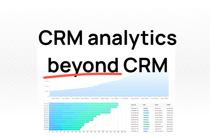
AI-native analytics (Fabi)This is the approach we built Fabi around. Connect your data sources — Stripe, HubSpot, Postgres, Google Sheets, and 100+ others — then ask questions in plain English.
"What's our MRR for each of the last 12 months?"
"Show CAC by acquisition channel for Q4."
"What's the activation rate for users who signed up through our blog vs. paid ads?"
You get a KPI dashboard, but you also get the ability to drill into any number instantly. When your CEO asks "why did NRR drop this month?" you don't need to open a different tool or file a ticket with the data team. You ask a follow-up question and get the answer in seconds.
Once you've picked your tool, connect the systems where your KPI data lives.
With traditional BI tools, this usually means setting up ETL pipelines, configuring data models, and writing SQL to transform raw data into the metrics you need. It works, but it takes time and ongoing maintenance.
With Fabi, you authenticate directly with your data sources. Connect Stripe, and your billing data is available immediately. Connect your product database, and you can query user behavior alongside revenue data. No ETL pipeline to build or maintain.
The key question at this step: does the data refresh automatically? A KPI dashboard that shows last week's data is a report, not a live tracker. Make sure your numbers update at least daily — hourly if your business moves fast enough to warrant it.
Keep it simple. A KPI dashboard should be scannable in under 10 seconds.
Layout principles:
Resist the urge to add more. If your KPI dashboard needs scrolling, it has too much on it.
A KPI dashboard nobody looks at is wasted effort. Make it part of your team's routine.
Tracking too many metrics. Twenty KPIs means none of them are "key." If your dashboard requires scrolling, cut it in half. Then cut it again.
Vanity metrics on the dashboard. Total signups looks impressive in an upward trend. But if 80% of those signups never activate, it's hiding a problem. Replace vanity metrics with actionable ones — activation rate tells you more than total signups.
No way to investigate. You see that churn spiked last month. Now what? If your KPI dashboard tool doesn't let you drill into the data — filter by segment, look at individual accounts, check which cohort drove the change — you'll end up in a spreadsheet every time something looks off.
Stale data. A KPI dashboard that updates weekly is a report. One that someone manually refreshes is a time bomb. If your KPI tracker doesn't pull live data from source systems, it will eventually show wrong numbers, and your team will stop trusting it.
Building it and forgetting it. The dashboard you built in January doesn't reflect your March priorities. Products launch, pricing changes, new channels open. Without regular review, your KPI dashboard becomes decoration.
One dashboard for everyone. Your CEO, your marketing lead, and your engineering manager need different KPIs. A single dashboard that tries to serve all of them serves none of them well. Build role-specific views, even if they share some underlying data.
The best KPI dashboard isn't the one with the most metrics or the prettiest charts. It's the one your team actually opens every morning, that surfaces problems before they become crises, and that answers follow-up questions without a three-day turnaround from the data team.
Start with three to five KPIs tied to your current goals. Connect your data so the numbers stay current. And pick a tool that lets you explore — because the most valuable moment with a KPI dashboard isn't reading it, it's asking "why?" when a number moves.
Try Fabi free — connect your data sources and build your first KPI dashboard in minutes, not weeks.