.svg)


CRM analytics beyond your CRM: how to build reports your sales tool can't

TL;DR: Every SaaS company needs MRR, churn, and retention dashboards, but billing tools like Stripe and Chargebee don't provide them out of the box. Dedicated SaaS metrics tools (ChartMogul, Baremetrics) are great for standard metrics. When you need custom analysis or want to combine billing data with CRM and product data, an AI-native platform like Fabi.ai gets you from raw billing data to a full SaaS dashboard in minutes, no data warehouse required.
Every SaaS company tracks MRR, churn, and expansion revenue. Few do it well.
Your billing system records every transaction. Stripe knows about every subscription created, every invoice paid, every upgrade and downgrade. Chargebee and Recurly do the same. The raw data is all there.
But open your Stripe dashboard and try to answer: "What's our net revenue retention by quarterly cohort?" or "Which pricing plan has the highest expansion rate?" You'll find subscription counts and gross volume. You won't find the metrics your board is asking about.
So you end up in spreadsheets. You download a CSV of invoices, build a formula to categorize each line as new, expansion, contraction, or churn, and manually compute an MRR waterfall. It works until pricing changes, prorations appear, or someone switches from annual to monthly mid-cycle. Then it breaks quietly, and nobody notices until the numbers don't add up at the board meeting.
There's a faster path, and it doesn't require a data warehouse or a dedicated finance team.
Stripe, Chargebee, and Recurly are excellent at what they do: manage subscriptions, process payments, handle invoicing. Their built-in dashboards reflect that focus.
What you get from a billing dashboard:
For payment operations, this is useful. You can see if revenue is flowing, catch spikes in failed payments, and track refund rates.
What you don't get:
These are the metrics investors ask about, the numbers that tell you whether your business is actually healthy. And they require calculations that billing dashboards simply don't perform.
The gap gets worse when you need to combine billing data with other sources. LTV is useful on its own, but LTV by acquisition channel requires CRM or marketing data. Churn rate matters, but churn correlated with product usage tells you something actionable. Your billing system can't reach into those other systems.
Then there's the spreadsheet tax. Every month, someone:
This process is slow, error-prone, and fragile. It breaks the moment your pricing model changes or you introduce a new plan tier. Prorations are particularly painful: a mid-cycle upgrade generates a credit and a new charge, and if your formula doesn't handle both correctly, your MRR numbers are wrong.
Most teams tolerate this because they think the alternative is a data warehouse project. It isn't.
Before building a dashboard, it helps to know what you're measuring and where the inputs come from. This isn't a textbook definitions section. It's a practical map of what each metric needs.
MRR and ARR
Net revenue retention (NRR)
Churn rate
LTV and CAC payback
Expansion revenue
The pattern: most of these metrics start with billing data but need either careful transformation or data from a second source to be truly useful.
The most common starting point.
How it works: Export your Stripe or Chargebee data to CSV. Build an MRR waterfall in Google Sheets. Categorize each invoice line as new, expansion, contraction, or churned revenue. Chart it.
When it's fine:
Where it breaks:
Spreadsheets are a reasonable starting point for very early-stage companies. But they're a temporary solution that most teams outgrow within a few months.
Tools like ChartMogul, Baremetrics, and ProfitWell (now Paddle) exist specifically for this problem. They plug directly into Stripe, Chargebee, or Recurly and auto-calculate the standard SaaS metrics.
What you get:
This is genuinely good for standard metrics. If your primary need is a clean MRR dashboard connected to Stripe, these tools deliver it with minimal setup. They handle the edge cases (prorations, trials, credits) that make spreadsheets painful.
Where they fall short:
For teams that just need standard SaaS metrics from their billing system, these tools are a solid choice.
This is the approach we built Fabi around.
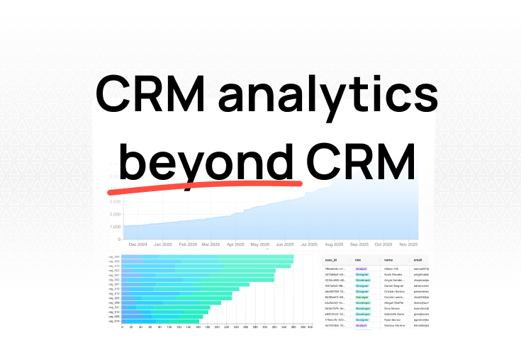
How it works: Connect your Stripe account, your Postgres or MySQL billing database, or payment data directly. Then ask questions in plain English:
"What's our net revenue retention by quarterly signup cohort?"
"Which pricing plan has the highest expansion rate?"
"Show me the MRR waterfall for the last 12 months, broken down by plan tier."
"What's the median time from trial start to first paid invoice?"
We generate the SQL behind every query, so you can see exactly how each metric is calculated. No black box. If you disagree with how something is categorized, you can adjust the logic or ask a follow-up question.
Why this approach is different:
These cross-source questions are where the actual strategic insights live. And they're questions that neither billing dashboards nor dedicated SaaS metrics tools can answer.
Being honest about the trade-offs: Dedicated SaaS metrics tools are faster for standard metrics. If all you need is an MRR dashboard from Stripe, ChartMogul will get you there with less setup. Fabi is the better choice when you need custom analysis, cross-source queries, or when you want one platform that handles billing analytics alongside everything else.
Step 1: Pick your core metrics.Start with three: MRR, churn rate, and net revenue retention. These give you a clear picture of revenue health. Add LTV, CAC payback, and expansion metrics later.
Step 2: Connect your billing data source.Whether it's a Stripe integration, a direct database connection, or an API, get your billing data into your analytics tool. With Fabi, this takes a few minutes: authenticate with Stripe or connect your billing database, and your data is available immediately.
Step 3: Ask your first question.Start simple. "What's our MRR for each of the last 12 months?" See if the numbers match your expectations. If something looks off, investigate. This validation step catches data quality issues early, before you build a dashboard on top of wrong numbers.
Step 4: Build out the dashboard.
Step 5: Combine with other sources.This is where things get interesting:
Step 6: Share with your team.A dashboard nobody looks at is a wasted dashboard. Share it with your co-founders, finance lead, and board. Set up a recurring review cadence. The best SaaS dashboards aren't just tracking metrics, they're driving conversations about what to do next.
Your billing system captures every transaction, every subscription change, every payment. The raw material for a complete SaaS metrics dashboard is already there, generated automatically every time a customer signs up, upgrades, or cancels.
The gap isn't data. It's the layer between raw transactions and the metrics that actually inform decisions. MRR waterfalls, cohort retention curves, expansion rates by segment. These are the views that tell you whether your business is healthy, where the risks are, and where the opportunities live.
You don't need a data warehouse to get there. You don't need a finance team building spreadsheets every month. Connect your billing data, start with the three metrics that matter most, and build from there.
Try Fabi free and build your first SaaS metrics dashboard today.