.svg)


Best BI tools for startups in 2026

TL;DR: Fabi.ai is our pick for teams that want AI-powered reporting without needing a data engineer — natural language querying, broad connectors, and automated report delivery to Slack and email. Looker is the enterprise standard for governed, metrics-layer reporting. Power BI fits Microsoft shops. Metabase is the strongest open-source choice for SQL-comfortable teams. Sigma and Equals are worth a close look if your team thinks in spreadsheets.
Reporting should be the easy part. You already did the hard work — collecting data, running campaigns, closing deals. But when someone asks "how did Q1 go?" the answer usually involves exporting CSVs from three different tools, pasting them into a spreadsheet, and spending an afternoon building charts that are outdated by the time you share them.
Online reporting tools exist to close that gap. They connect to your data sources, let you build reports and dashboards, and distribute the results to the people who need them. The problem is that there are dozens of options, and they vary wildly in how much technical skill they require, what data sources they support, and what they cost.
This guide reviews 10 online reporting tools for data analytics in 2026. We cover what each does well, where it falls short, pricing, and which type of team it fits best.
Not every reporting tool works for every team. Before comparing platforms, these are the criteria that matter most for small and mid-sized data analytics teams:
Data source connectivity. Your data probably lives in multiple places — a warehouse like Snowflake or BigQuery, SaaS tools like HubSpot or Stripe, and inevitably a few Google Sheets. The best reporting tools connect to all of them without requiring you to consolidate everything into a warehouse first.
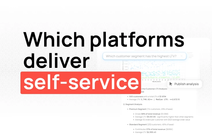
Self-service for non-technical users. If only the analyst can build reports, they become a bottleneck. Tools with AI or natural language querying let PMs, marketers, and ops people pull their own numbers without writing SQL.
Report sharing and scheduling. A report nobody sees is a waste of time. Look for automated delivery — push reports to Slack channels, email stakeholders on a schedule, or write results back to shared spreadsheets.
Setup speed and maintenance overhead. Enterprise BI platforms can take weeks to configure with semantic layers and data models. Smaller teams need to connect a data source and have a working report the same day.
Pricing at small-team scale. Per-seat pricing compounds fast. Some tools charge per viewer, others per editor, others by data volume. Understand the model before you commit, especially if you need to share reports widely.
We built Fabi for teams where nobody's full-time job is building reports. The core concept: describe what you want to see in plain English, and Fabi's AI writes the SQL, builds the visualization, and places it in a shareable Smartbook — our take on interactive notebooks that combine reports, analysis, and dashboards in one workspace.
What makes this practical for reporting specifically is the range of inputs it handles. A growth marketer can ask "show me weekly signups by channel for the last 90 days" and get a chart back in seconds. An analyst on the same team can inspect the generated SQL, switch to Python for a cohort analysis, and pin both outputs to the same report. Everyone works at their own technical depth.
Connectors cover the standard data analytics stack — Snowflake, BigQuery, Postgres, Redshift, plus direct connections to Google Sheets, HubSpot, Stripe, Segment, and others. This matters because most teams don't have all their data neatly organized in a single warehouse yet.
Where Fabi goes further than most reporting tools is distribution. You can set up workflows that push finished reports to Slack channels on a schedule, email stakeholders when a metric crosses a threshold, or write summary tables back to Google Sheets. This solves the most common reporting failure mode — reports that exist but nobody checks.
We're transparent about limitations: Fabi is not designed for complex enterprise data modeling with strict governance layers. If you need row-level security across thousands of users or a full semantic layer managed by a BI team, tools like Looker or Tableau are built for that. For teams under 400 people who want fast, AI-powered reporting without dedicating headcount to maintain it, this is what we built.
Pros:
Cons:
Best for: SMB and mid-market teams (product, growth, ops) that need self-service reporting without hiring a data engineer.
Pricing: Free tier available, then $39/month per builder. Viewers are free.
Looker (now part of Google Cloud) is built around a semantic modeling layer called LookML. Instead of letting everyone write their own SQL and potentially get different numbers for the same metric, Looker centralizes metric definitions in code. Every report, dashboard, and ad hoc query pulls from the same governed source of truth.
This makes Looker particularly strong for organizations where "what counts as revenue?" or "how do we define an active user?" are questions that need one canonical answer. Data teams define the logic in LookML, and business users explore data through a browser-based interface without writing SQL. The results are always consistent because the definitions live in one place.
Looker connects natively to cloud warehouses — BigQuery, Snowflake, Redshift, Databricks — and runs queries against them in real time rather than importing data into its own layer. This is an architectural advantage if you've already invested in a warehouse, but it means Looker doesn't work well without one. There are no direct connectors to SaaS tools like HubSpot or Stripe — your data needs to be in the warehouse first.
The main barriers are cost and complexity. Looker pricing requires a sales conversation and is generally enterprise-level. LookML has a real learning curve — you need a data team member to set up and maintain the models. For small teams without a warehouse or a dedicated analyst, Looker is more infrastructure than you need. For teams that have outgrown ad hoc SQL queries and need consistent, governed reporting, it's the standard.
Pros:
Cons:
Best for: Data teams at mid-market and enterprise companies that need governed, consistent reporting on top of a cloud warehouse.
Pricing: Contact Google Cloud for pricing (enterprise plans).
Power BI is Microsoft's reporting and business intelligence platform. If your company runs on Microsoft 365 and Azure, it integrates deeply with Excel, Teams, SharePoint, and Azure data services. For organizations already paying for the Microsoft stack, adding Power BI is a relatively low-friction decision.
The desktop application is powerful — it handles complex data modeling with DAX (Data Analysis Expressions), supports a wide range of connectors, and produces polished reports. Microsoft's Copilot is adding natural language capabilities for building and querying reports, though these features are still maturing and often tied to specific Fabric or tenant configurations.
For small teams, the main friction points are complexity and ecosystem lock-in. DAX is its own language — it's not SQL, and the learning curve is real. Licensing can be confusing, with different tiers (Pro, Premium Per User, Premium Per Capacity) unlocking different features. And while Power BI connects to non-Microsoft sources, those integrations don't always work as smoothly as the native ones.
Pros:
Cons:
Best for: Teams already invested in the Microsoft ecosystem who want reporting and BI integrated with their existing tools.
Pricing: $14–24/user/month (Power BI Pro included with some M365 E5 plans).
Metabase is the most popular open-source BI and reporting tool, and for good reason. It's clean, easy to deploy, and strikes a good balance between simplicity and capability. If you have someone on the team who can write SQL and you want to keep costs low, Metabase is a strong default choice.
The query builder lets less technical users create basic reports without SQL, while analysts can write raw queries and build more complex dashboards. Self-hosting is free, and the cloud-hosted version starts at $85/month for five users. The UI is well-designed — it doesn't feel like open-source software in the way that sometimes means "functional but ugly."
The main limitations show up around modern reporting needs. Metabase doesn't connect directly to SaaS tools — you need to ETL data from HubSpot, Stripe, or Google Sheets into a database first. Its AI features (Metabot) are in beta and limited to paid cloud plans. Automated report delivery to Slack or Google Sheets requires workarounds or additional tooling. For teams that need self-service analytics without SQL skills, the learning curve may be too steep.
Pros:
Cons:
Best for: Technical teams comfortable with SQL who want a low-cost, self-hosted reporting tool.
Pricing: Free (self-hosted), Metabase Cloud from $85/month for 5 users.
Tableau set the standard for data visualization and remains the most capable tool for building complex, interactive reports. If your reporting needs go beyond bar charts and line graphs — think geographic maps, statistical overlays, multi-level drill-downs — Tableau handles that better than anything else on this list.
The authoring experience in Tableau Desktop is unmatched for power users. You can combine multiple data sources, create sophisticated calculated fields, build parameter-driven reports, and produce visualizations that genuinely help people understand complex data. Tableau Public also provides a free version for public data projects.
The downsides are cost and complexity. Tableau Creator licenses start at $75/user/month, and you'll likely need Tableau Cloud or Server for sharing. The learning curve is significant — building effective Tableau reports is a real skill that takes months to develop. For small teams that need a quick chart showing MRR by month, Tableau is overkill. For data analysis teams that need to communicate complex findings visually, it's hard to beat.
Pros:
Cons:
Best for: Data teams that need advanced visualization and are willing to invest in learning the tool.
Pricing: Tableau Creator from $75/user/month; Viewer and Explorer tiers available at lower cost.
Sigma takes the familiarity of a spreadsheet and connects it directly to your cloud data warehouse. The interface looks and feels like a spreadsheet — formulas, pivot tables, conditional formatting — but instead of working on a local CSV, you're querying Snowflake, BigQuery, or Databricks in real time. No SQL required, though analysts can drop into SQL when they need to.
This is a smart approach for teams where the people who need reports are fluent in Excel but don't write SQL. A finance lead can build a revenue report the same way they would in Google Sheets, except the data is live, governed, and doesn't break when someone accidentally deletes a row. Sigma handles the translation to SQL behind the scenes.
Sigma also supports collaborative workbooks that combine data exploration, charts, and tables in one shareable document — closer to how people actually work with data than the traditional dashboard paradigm. Version history and row-level security are built in, which makes it viable for teams with compliance requirements.
The trade-offs: Sigma requires a cloud warehouse, so it's not a fit for teams whose data lives entirely in SaaS tools and spreadsheets. The spreadsheet metaphor can also hit limits with very complex analytical workflows — if you need Python or notebook-style analysis, you'll need another tool alongside it. Pricing is per-user and not publicly listed.
Pros:
Cons:
Best for: Teams with a cloud warehouse whose report builders are more comfortable in spreadsheets than in SQL or BI tools.
Pricing: Contact Sigma for pricing (per-user, cloud-only).
If your company already uses Zoho CRM, Zoho Projects, or other Zoho products, Zoho Analytics is the natural choice for reporting. It pulls data from across the Zoho suite without any integration work, and pricing starts low enough that it's accessible to very small businesses.
Beyond the Zoho ecosystem, it connects to common databases, spreadsheets, and cloud storage. The AI assistant (Zia) handles natural language queries and generates basic reports. The report builder is drag-and-drop and approachable for non-technical users.
The limitations are mainly about depth and flexibility. Zoho Analytics works best within the Zoho ecosystem — integrations with non-Zoho tools exist but aren't always as smooth. Customization options for visualizations are more limited than Tableau or Power BI. And while Zia's AI is helpful for simple queries, it doesn't match the capabilities of tools like Fabi for complex analytical questions.
Pros:
Cons:
Best for: Small businesses already using Zoho products that want integrated reporting at low cost.
Pricing: From $30/month for 2 users (higher tiers for more users and features).
Equals is a spreadsheet built specifically for reporting. It looks like Google Sheets, but it connects directly to databases and SaaS tools — Postgres, Snowflake, BigQuery, Stripe, HubSpot, and others — and lets you pull live data into familiar rows and columns. Write a SQL query (or use the visual query builder), and the results populate a spreadsheet you can format, chart, and share like any other.
The key insight is that many startups already build their reports in spreadsheets. Equals doesn't try to replace that workflow — it makes it better by eliminating the manual export-paste-format cycle. Queries refresh on a schedule, charts update automatically, and you can build dashboards from spreadsheet data without switching to a separate tool.
Equals also supports versioning, team collaboration, and scheduled snapshots, which addresses the biggest problems with spreadsheet-based reporting: broken formulas, stale data, and "which version is current?" confusion.
The limitations are scope-related. Equals is designed for startup and growth-stage teams, not enterprise deployments. It doesn't have the governance, semantic layer, or role-based access controls that larger organizations need. Visualization options are good for a spreadsheet-based tool but don't match dedicated BI platforms. And if your team has moved past spreadsheet-style workflows, a tool like Fabi or Metabase may be a better fit.
Pros:
Cons:
Best for: Startup and growth-stage teams that want to keep building reports in spreadsheets but need live data connections and scheduled refreshes.
Pricing: Free tier available, paid plans from $49/month per user.
Klipfolio specializes in real-time KPI dashboards that pull data from SaaS tools and display it on shared screens, TVs, or web dashboards. If your team wants a live view of marketing metrics, sales pipeline, or support queue — without building a full BI stack — Klipfolio does that well.
The platform offers two products: Klipfolio (the dashboard builder) and PowerMetrics (a metric-centric analytics layer). The dashboard builder connects to 100+ data sources, including Google Analytics, Salesforce, HubSpot, and SQL databases. Reports refresh automatically and display cleanly on wall-mounted screens.
The limitations are similar to other dashboard-focused tools. Klipfolio is designed for monitoring, not analysis. You can't write SQL queries, run Python scripts, or do ad hoc exploration. Custom visualizations are constrained to what the builder supports. For teams that need reporting that goes beyond "display these metrics in real time," you'll outgrow it.
Pros:
Cons:
Best for: Teams that want live KPI dashboards on screens or shared views with minimal setup.
Pricing: From $125/month for Klipfolio dashboards; PowerMetrics has a free tier.
Rows (rows.com) is a spreadsheet tool that connects to live data sources through built-in integrations and API calls. The pitch: use a spreadsheet interface you already know, but instead of importing CSVs, pull data directly from Google Analytics, Stripe, LinkedIn Ads, Salesforce, and 50+ other services using pre-built functions. Need something custom? Rows lets you call any REST API directly from a cell.
For marketing and ops teams, this is practical. You can build a report that pulls ad spend from Google Ads, revenue from Stripe, and signups from your database — all refreshing automatically — without writing code or maintaining data pipelines. The API-calling feature is unique among spreadsheet-style tools and opens up data sources that other tools don't cover.
Rows also includes AI features for summarizing data, generating formulas, and building charts from natural language descriptions. These are helpful for getting started quickly, though they're more suited to simple analyses than complex reporting.
The trade-offs are predictable for a spreadsheet-based tool. Rows is not designed for large datasets, complex data modeling, or enterprise governance. Performance slows with large tables. The visualization options are basic compared to dedicated BI tools. And while the API integration is powerful, it requires some technical understanding to set up and debug when things break.
Pros:
Cons:
Best for: Marketing, ops, and growth teams that need to pull data from multiple SaaS tools into a spreadsheet without engineering support.
Pricing: Free tier available, Pro from $59/month for teams.
Your team's size, technical depth, budget, and data stack should drive the decision. Here's a quick framework:
What is an online reporting tool?An online reporting tool is web-based software that connects to your data sources, lets you build reports and visualizations, and shares them with your team. Unlike desktop tools or spreadsheets, online reporting tools keep data connected and reports up-to-date automatically.
What's the difference between a reporting tool and a BI platform?In practice, the terms overlap significantly. Reporting tools tend to focus on creating and distributing reports from existing data. BI platforms typically add data modeling, governance layers, and deeper analytical capabilities. Many tools on this list do both — the distinction matters less than whether the tool fits your team's needs and technical level.
Can I use a reporting tool without SQL knowledge?Yes. Tools like Fabi (AI-powered natural language queries), Sigma (spreadsheet interface on warehouse data), Rows (built-in SaaS integrations), Zoho Analytics (Zia AI assistant), and Klipfolio (pre-built connectors) are all designed for non-technical users. That said, having someone on the team who can write SQL will always expand what you can do with any reporting tool.
Are there free online reporting tools?Metabase is free to self-host. Fabi, Equals, Rows, and Zoho Analytics offer free tiers. Power BI is included in some Microsoft 365 plans. Most other tools on this list require paid plans starting at $30-125/month.
For most data analytics teams at small and mid-sized companies, the choice comes down to three factors: how technical your team is, where your data lives, and whether you need reports to reach people automatically.
If you have analysts who write SQL, Metabase gives you solid reporting at low cost. If your team thinks in spreadsheets, Equals and Sigma both connect live data to a familiar interface — Equals for startups pulling from databases and SaaS tools, Sigma for teams with an existing cloud warehouse. If you want AI to handle the translation from business question to finished report — and you want those reports pushed to Slack and email without manual work — that's what we built Fabi to do.
The best way to evaluate is to build one real report with your actual data. Connect a source, create a report your team actually needs, and see how long it takes. That tells you more than any feature comparison.
You can try Fabi free and have your first report running in minutes.