
.svg)


.avif)
How to use Python and AI for sentiment analysis: Step-by-step tutorial
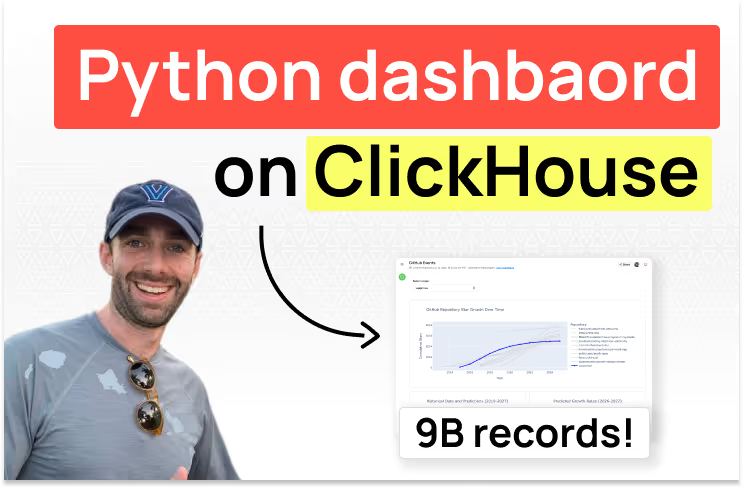
TL;DR: ClickHouse is able to proces million or even billions of records in milliseconds. Fabi.ai can turn query results into Python dashboards with the help of AI. To get started, connect ClickHouse to Fabi.ai and start asking the AI to build a report.
Analyzing 9 billion+ events might sound like a daunting (and expensive) task. But with ClickHouse and Fabi.ai, you can explore this kind of data interactively, train models, and build dashboards without setting up a complex pipeline or distributed compute cluster.
In this post, we’ll walk through a step by step tutorial showing you how to query terabytes of data from ClickHouse and share your insights in the form of a Python dashboard. For this tutorial, we’ll be identifying the most popular GitHub repositories and forecasting future growth based on star history. We'll use ClickHouse to process and aggregate massive amounts of event data, and Fabi.ai to pull the results into Python for visualization and modeling.
ClickHouse provides a public dataset containing information about public GitHub repositories and related events. We’ll be using this data to draw trends for specific repositories, plot those trends and predict the next few years.
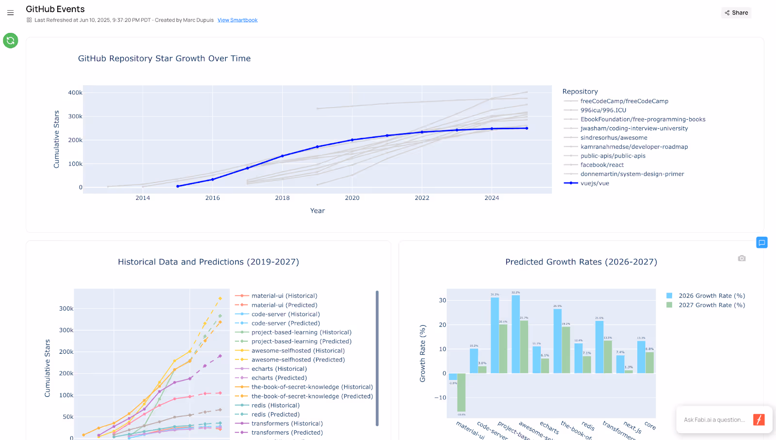
Your dashboard will look something like this:
By the end of this article you’ll:
If you're a visual learner, we also have a video that walks you through this dashboard step-by-step:
ClickHouse is a columnar OLAP database designed specifically for fast analytical queries at scale. That means it can handle billions of rows efficiently, especially for workloads like filtering events by time, calculating aggregates, or running window functions.
For something like GitHub events—which includes over 9 billion rows in ClickHouse’s public sample—this performance is essential. But ClickHouse alone doesn’t support advanced modeling, visualization, or interactivity. That’s where Python comes in, and why we’re using Fabi: it gives you SQL, Python, and no-code controls in one interface thanks to its Smartbooks.
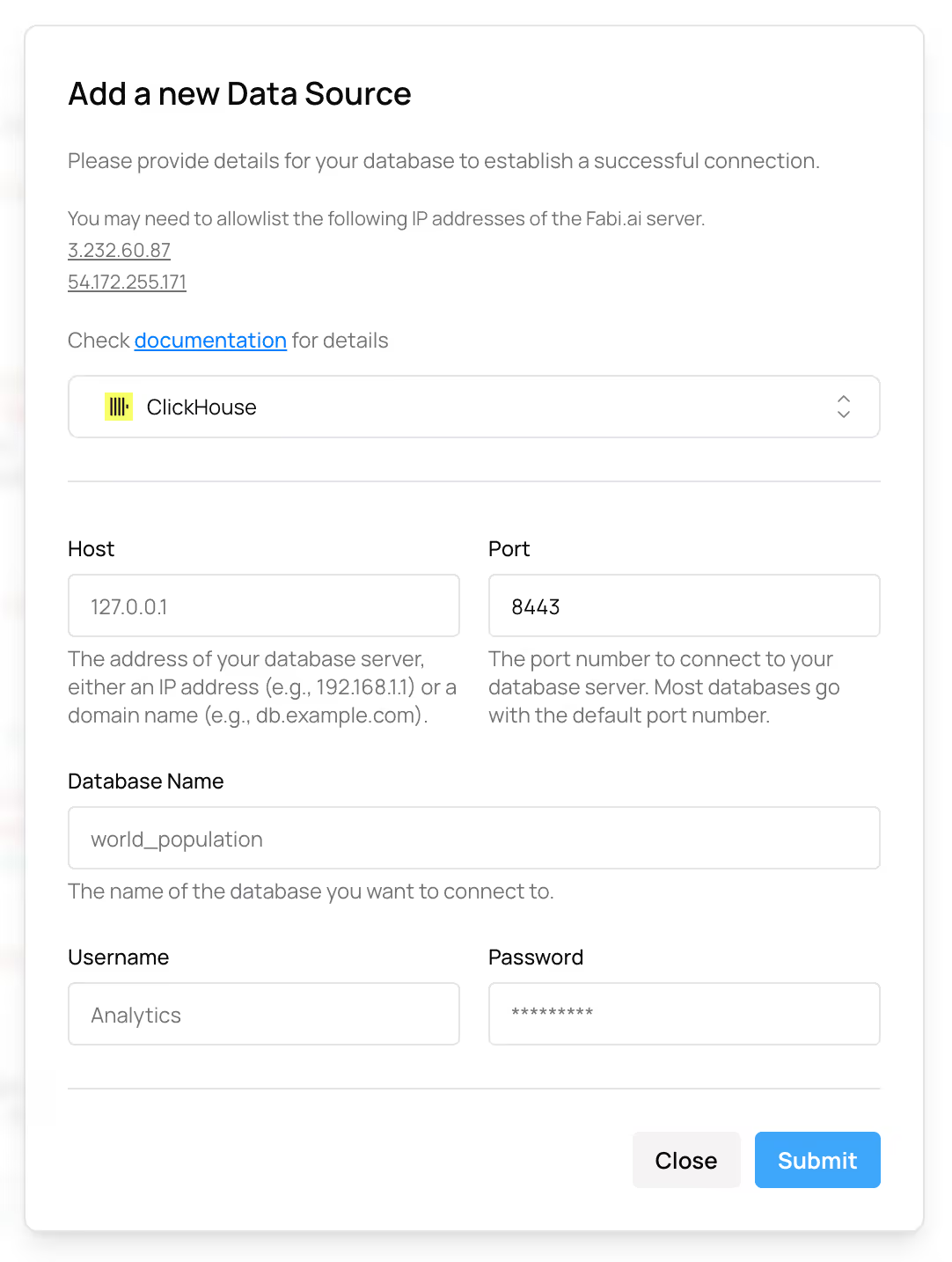
If you haven’t already, create a Fabi.ai account (you can create your account in less than 2 minutes for free). Once you have your account, add ClickHouse as a data source. If you don’t already have a ClickHouse account or if you want to use the exact same data that we used in this tutorial, you can connect your Fabi account to the ClickHouse playground which already contains all the data you need to follow along.
That’s it, now we’re ready to analyze ClickHouse data.
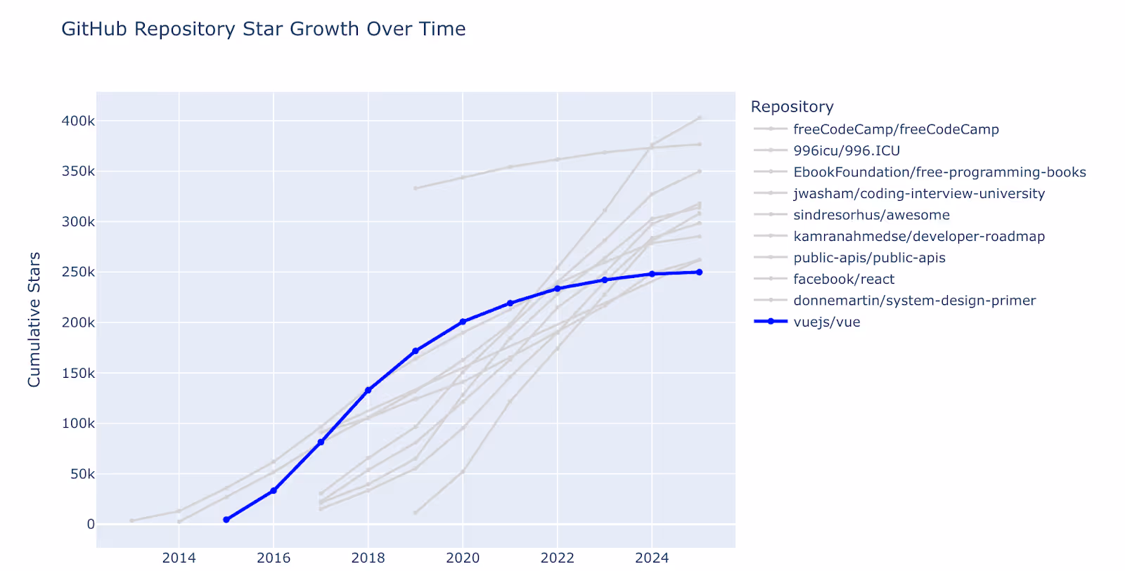
Before diving right into machine learning models, let’s start by building a simple chart that shows the most popular public repositories by number of stars (stargazers), and adding a filter so our stakeholders can visualize a repository of their choosing against those top repositories. Here’s the end result we’re going for:
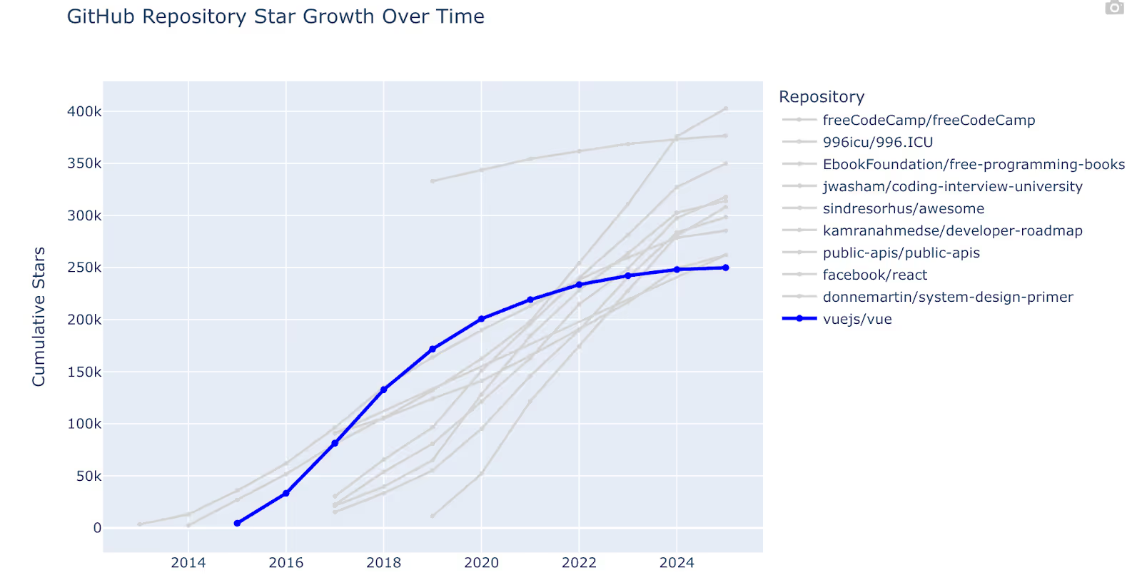
A note on this data: The GitHub events include a WatchEvent event type with a start action. This indicates that a user starred the repository. However, there’s no event to track unstarring. This is fine for the sake of this analysis, and we can generally assume that if repositories aren’t receiving new stars that they’re losing popularity.
Before jumping right to the chart, which we’ll get to in a minute, we need to pull the data. This is an important step. There are over 9 billion event records in this dataset, and that’s much more than we ever need to analyze in a single chart and certainly much more than is recommended handling in a Python DataFrame. So let’s start by slicing our data to pull aggregate metrics for the top repositories. This is where ClickHouse shines.
For example, to count the number of star events, we can pull the list of events from selected repositories then count the number of stars by year for those repositories. Using two CTEs, this is what it looks like:
star_events AS (
    -- Get all star events (WatchEvent) for these top repositories
    SELECT
        repo_name,
        created_at,
        toYear(created_at) as year
    FROM github_events
    WHERE event_type = 'WatchEvent'
        AND action = 'started'  -- This represents starring a repo
        AND repo_name IN (SELECT full_name FROM top_repos_2020)
),
yearly_stars AS (
    -- Count stars accumulated each year for each repository
    SELECT
        repo_name,
        year,
        COUNT(*) as stars_gained_this_year,
        SUM(COUNT(*)) OVER (PARTITION BY repo_name ORDER BY year) as cumulative_stars
    FROM star_events
    GROUP BY repo_name, year
    ORDER BY repo_name, year
)
Your complete query will look something like this (hint you should leverage AI to generate this instantly):
-- Get top 20 repositories by stars as of 2020 and track their star growth over time
WITH top_repos_2020 AS (
    -- Get top 20 repositories by star count (using current snapshot as proxy for 2020)
    SELECT
        full_name,
        stargazers_count,
        created_at
    FROM repos
    WHERE NOT fork  -- Exclude forks
        AND created_at <= '2020-12-31'  -- Only repos created by 2020
        AND stargazers_count > 0
    ORDER BY stargazers_count DESC
    LIMIT 20
),
star_events AS (
    -- Get all star events (WatchEvent) for these top repositories
    SELECT
        repo_name,
        created_at,
        toYear(created_at) as year
    FROM github_events
    WHERE event_type = 'WatchEvent'
        AND action = 'started'  -- This represents starring a repo
        AND repo_name IN (SELECT full_name FROM top_repos_2020)
),
yearly_stars AS (
    -- Count stars accumulated each year for each repository
    SELECT
        repo_name,
        year,
        COUNT(*) as stars_gained_this_year,
        SUM(COUNT(*)) OVER (PARTITION BY repo_name ORDER BY year) as cumulative_stars
    FROM star_events
    GROUP BY repo_name, year
    ORDER BY repo_name, year
)
-- Final result: show star progression for top repos
SELECT
    tr.full_name as repository,
    tr.stargazers_count as total_stars_current,
    ys.year,
    ys.stars_gained_this_year,
    ys.cumulative_stars
FROM top_repos_2020 tr
LEFT JOIN yearly_stars ys ON tr.full_name = ys.repo_name
ORDER BY tr.stargazers_count DESC, ys.year ASC
Now with this you have the number of cumulative stars by year for the top repositories.
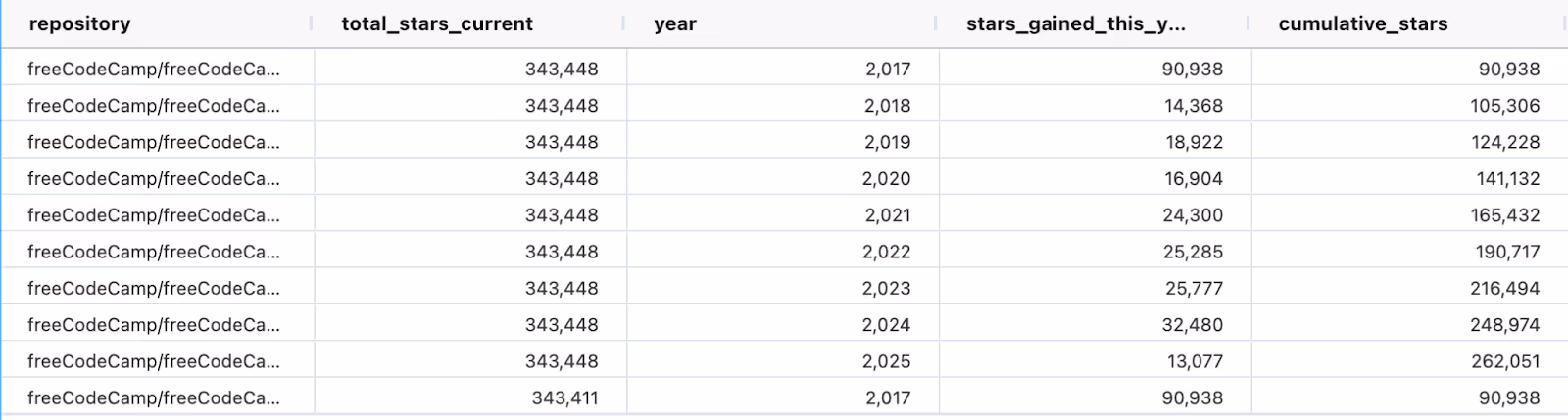
Fabi automatically stores the results as a Pandas DataFrame.
If you remember in the chart above, we did want to let our peers select a specific repository to compare to these top repositories. This will help them understand how their favorite repo compares to the best of the best. So to do this, we need to write another query just for a designated repository. You can insert a new SQL cell and manually write the query or ask the AI to generate a new query for you. This query will look very similar to the query above, with the exception of another filter:
star_events AS (
    -- Get all star events (WatchEvent) for this repository
    SELECT
        repo_name,
        created_at,
        toYear(created_at) as year
    FROM github_events
    WHERE event_type = 'WatchEvent'
        AND action = 'started'  -- This represents starring a repo
        AND repo_name = 'vuejs/vue'
),
This will store the star history for just that repo in a second Python DataFrame. If you want to make this dynamic with a dropdown that your peers can select from, you can parametrize the repo_name filter using {{}}
star_events AS (
    -- Get all star events (WatchEvent) for this repository
    SELECT
        repo_name,
        created_at,
        toYear(created_at) as year
    FROM github_events
    WHERE event_type = 'WatchEvent'
        AND action = 'started'  -- This represents starring a repo
        AND repo_name = '{{selected_repo}}'
),
Once you’ve done this, add a filter above this SQL cell with a variable named selected_repo. More on how to create filters and inputs in Fabi here including a short tutorial video.
Now that we’re equipped with the data we need to plot the trends of top repositories and our repo of choice stored as DataFrames, let’s turn to Python.
In a cell below your two SQL cells, create a new Python cell. Or better yet, ask Fabi.ai’s AI Analyst Agent to write a script to plot the trend of each repository over time. Here’s the prompt I used:
Use @dataframe1 and @dataframe2 to create a plot of the number of stars over time for each repository. Mark the dataframe2 repository in blue and make all other lines grey.The AI should generate a Python snippet that generally looks something like:
# Create copies of the dataframes for processing
github_stars_df = dataframe1.copy()
vue_df = dataframe2.copy()

# Get the top 10 repositories by current star count for better visualization
top_repos = github_stars_df.groupby('repository')['total_stars_current'].first().sort_values(ascending=False).head(10).index
filtered_df = github_stars_df[github_stars_df['repository'].isin(top_repos)].copy()

# Combine the dataframes - add Vue.js data to the filtered data
# Remove Vue.js from filtered_df if it already exists to avoid duplicates
filtered_df = filtered_df[filtered_df['repository'] != 'vuejs/vue'].copy()

# Add Vue.js data from dataframe2
vue_data = vue_df[['repository', 'year', 'cumulative_stars']].copy()
combined_df = pd.concat([
    filtered_df[['repository', 'year', 'cumulative_stars']],
    vue_data
], ignore_index=True)

# Create the line chart
fig = go.Figure()

# Add lines for all repositories except Vue.js (in grey)
for repo in combined_df['repository'].unique():
    if repo != 'vuejs/vue':
        repo_data = combined_df[combined_df['repository'] == repo]
        fig.add_trace(go.Scatter(
            x=repo_data['year'],
            y=repo_data['cumulative_stars'],
            mode='lines+markers',
            name=repo,
            line=dict(color='lightgrey', width=2),
            marker=dict(color='lightgrey', size=4)
        ))

# Add Vue.js line in blue
vue_data_plot = combined_df[combined_df['repository'] == 'vuejs/vue']
if not vue_data_plot.empty:
    fig.add_trace(go.Scatter(
        x=vue_data_plot['year'],
        y=vue_data_plot['cumulative_stars'],
        mode='lines+markers',
        name='vuejs/vue',
        line=dict(color='blue', width=3),
        marker=dict(color='blue', size=6)
    ))

# Show the plot
fig.show()
This is a large chunk of code, but all it’s doing effectively is combining your two DataFrames and applying special treatment to the data for the handpicked repository.
Depending on the results on the first try, you may need to iterate a few times, but you should be able to quickly generate the same chart:
Now that we’ve created a chart to compare our favorite repo to the top public repos, let’s take a look at the fastest growing repositories and predict where they might go in the next few years.
Instead of looking at the top repositories by number of stars, let’s go back to ClickHouse and look for repositories with the fastest growth in the past 3 years. Again, ClickHouse will have no problem processing billions of records to retrieve this information.
I used AI to generate this query. The prompt I used:
Calculate the number of stars by year for repositories that have grown the fastest in the past 3 years. Remove repositories with fewer than 25k stars to just focus on repos that have reached a material size.The AI will generate a query that uses a window function:
yearly_stars AS (
    -- Count stars accumulated each year for each repository
    SELECT
        repo_name,
        year,
        COUNT(*) as stars_gained_this_year,
        SUM(COUNT(*)) OVER (PARTITION BY repo_name ORDER BY year) as cumulative_stars
    FROM star_events
    GROUP BY repo_name, year
    ORDER BY repo_name, year
),
And computes the growth rate:
growth_rate AS (
-- Calculate growth rate for past 3 years
SELECT
repo_name,
stars_gained_2022_2024,
stars_at_2021_end,
total_cumulative_stars,
CASE
WHEN stars_at_2021_end > 0
THEN (stars_gained_2022_2024 * 100.0) / stars_at_2021_end
ELSE stars_gained_2022_2024 * 100.0 -- For repos that started after 2021
END as growth_rate_percent
FROM recent_growth
WHERE stars_gained_2022_2024 > 0 -- Only repos that gained stars in past 3 years
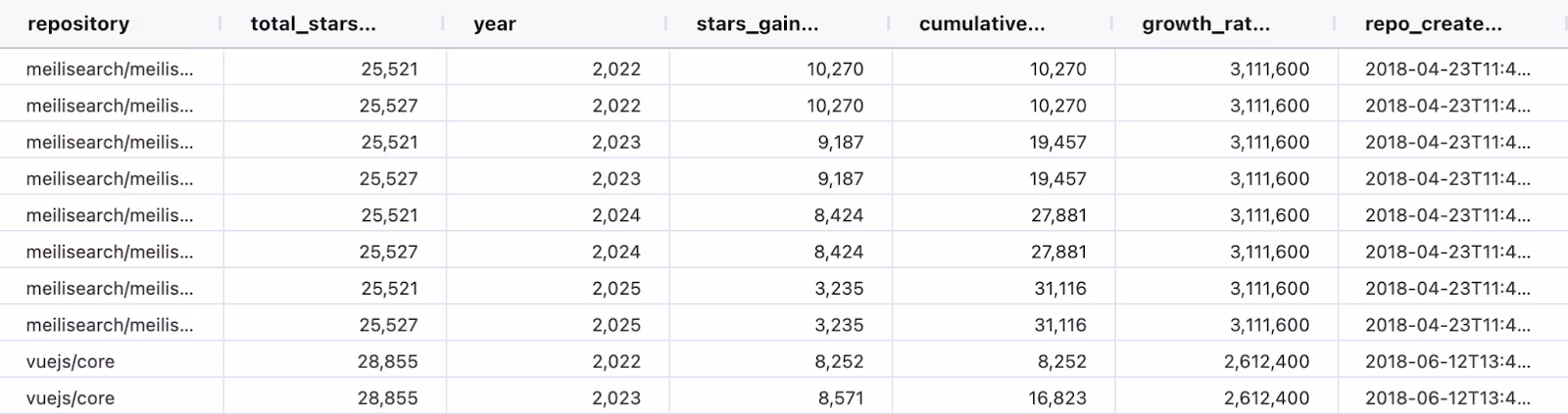
),As with the queries above, Fabi.ai, will automatically store the results in a Pandas DataFrame. This will make it easy to perform statistical and ML analysis.
Once you’re equipped with this data, you can then either write a custom ML function for the prediction, or ask the AI to do it for you. Again, I’ll turn to the AI and just ask it for a very simplistic approach. In my case, the AI chose to test a few models and pick the best one, which seemed like a great approach:
 # Linear regression
    linear_model = LinearRegression()
    linear_model.fit(X, y)
    linear_score = linear_model.score(X, y)
    models['linear'] = (linear_model, linear_score, 'linear')

    # Polynomial regression (degree 2)
    if len(repo_data) >= 4:
        poly_features = PolynomialFeatures(degree=2)
        X_poly = poly_features.fit_transform(X)
        poly_model = LinearRegression()
        poly_model.fit(X_poly, y)
        poly_score = poly_model.score(X_poly, y)
        models['poly'] = (poly_model, poly_score, 'poly', poly_features)

    # Exponential growth model (log-linear) - only if all values are positive
    try:
        if np.all(y > 0):
            log_y = np.log(y)
            exp_model = LinearRegression()
            exp_model.fit(X, log_y)
            exp_score = exp_model.score(X, log_y)
            models['exp'] = (exp_model, exp_score, 'exp')
    except:
        pass

    # Choose the best model
    best_model_name = max(models.keys(), key=lambda k: models[k][1])
    best_model_info = models[best_model_name]
Once you have your predictions, if the AI hasn’t already generated a plot, you can ask it to do so (in my case I was using Claude 4, which is generally fairly eager and did it proactively).
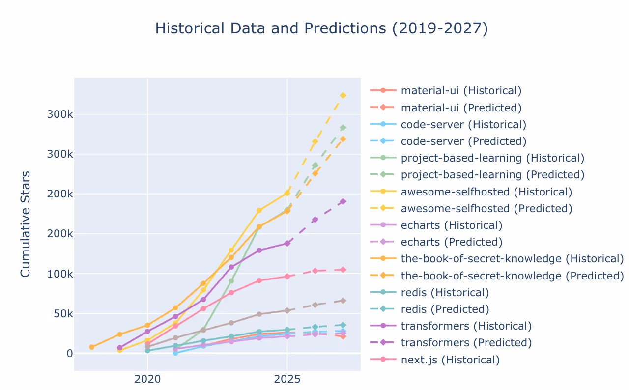
We can see from this trend that awesome-selfhosted, project-based-learning and the-book-of-secret-knowledge have all been crushing it and are on track to continue growing in the next two years, potentially soon reaching the ranks of the other top repos we saw above.
The final step of any analysis is sharing your findings with your coworkers. Fabi.ai makes this as simple as clicking two buttons with our Smart Reports. From your Smartbook, click the Publish button in the top right hand corner.

Re-arrange your widget as you see fit and add notes if you would like. Once you’ve completed the arrangement, click on Finish & View Report in the configuration panel on the right hand side. This will publish your dashboard which you can then share with your coworkers by clicking on the Share button in the top right hand corner.
Congratulations! You’ve turned 9 billion records into a beautiful, collaborative dashboard.
Here are a few tips to help you take your analysis and use of ClickHouse and Fabi to the next level:
You’re now equipped to analyze terabytes or even petabytes of data, build machine learning models and share them in dashboards. You can get started with ClickHouse for free and you can start with Fabi.ai for free as well and publish your first dashboard in less than 5 minutes.

.avif)
